
250x250
Notice
Recent Posts
Recent Comments
Link
| 일 | 월 | 화 | 수 | 목 | 금 | 토 |
|---|---|---|---|---|---|---|
| 1 | 2 | 3 | 4 | 5 | 6 | |
| 7 | 8 | 9 | 10 | 11 | 12 | 13 |
| 14 | 15 | 16 | 17 | 18 | 19 | 20 |
| 21 | 22 | 23 | 24 | 25 | 26 | 27 |
| 28 | 29 | 30 | 31 |
Tags
- css3
- keyframes
- 비전공자
- 프론트엔드
- 자바스크립트
- SWIFT
- effect
- MAC
- Animation
- 개발자
- CSS
- react
- button
- xcode
- image
- iPhone
- iOS 개발자
- 애니메이션
- ipad
- HTML
- jQuery
- hover
- html5
- 비전공 개발자
- javascript
- php
- front-end
- 백엔드
- 풀스택
- IOS
Archives
- Today
- Total
비전공자 개발일기
Sliding Card UI Design 본문
728x90
SMALL
<!DOCTYPE html>
<html lang="ko">
<head>
<meta charset="UTF-8">
<meta http-equiv="X-UA-Compatible" content="IE=edge">
<meta name="viewport" content="width=device-width, initial-scale=1.0">
<title>SLIDING CARD UI DESIGN</title>
<link rel="stylesheet" href="style.css">
<script defer src="main.js"></script>
</head>
<body>
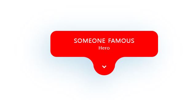
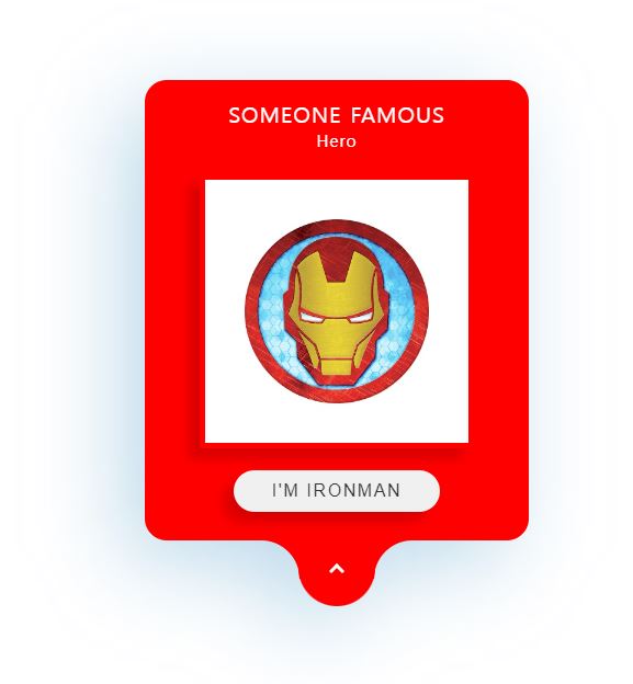
<div class="card">
<div class="contentBox">
<div class="content">
<h2>
Someone Famous <br>
<span>Hero</span>
</h2>
<div class="imgBox">
<img src="http://image.kyobobook.co.kr/newimages/giftshop_new/goods/400/1589/hot1549938828149.jpg" alt="Ironman">
</div>
<button>I'm IRONMAN</button>
</div>
</div>
<div class="toggle">
<span></span>
</div>
</div>
</body>
</html>* {
margin: 0;
padding: 0;
box-sizing: border-box;
}
body {
display: flex;
justify-content: center;
align-items: center;
min-height: 100vh;
}
.card {
position: relative;
width: 350px;
height: 85px;
background-color: #F00;
border-radius: 20px;
filter: drop-shadow(-20px 20px 40px #398CC055);
transition: .5s ease-in-out;
}
.card.active {
height: 420px;
}
.card.active .toggle span {
transform: translate(-50%, -70%) rotate(225deg);
}
.toggle {
position: absolute;
bottom: -60px;
left: 50%;
transform: translateX(-50%);
width: 70px;
height: 60px;
background-color: #F00;
border-bottom-left-radius: 35px;
border-bottom-right-radius: 35px;
cursor: pointer;
}
.toggle::before {
content: "";
position: absolute;
left: -34px;
width: 35px;
height: 35px;
background-color: transparent;
border-top-right-radius: 35px;
box-shadow: 11px -10px 0 10px #F00;
}
.toggle::after {
content: "";
position: absolute;
right: -34px;
width: 35px;
height: 35px;
background-color: transparent;
border-top-left-radius: 35px;
box-shadow: -11px -10px 0 10px #F00;
}
.toggle span {
position: absolute;
top: 50%;
left: 50%;
transform: translate(-50%, -50%) rotate(405deg);
width: 10px;
height: 10px;
border-bottom: 3px solid #FFF;
border-right: 3px solid #FFF;
transition: .5s ease-in-out;
}
.contentBox {
position: absolute;
inset: 0;
overflow: hidden;
}
.contentBox .content {
position: relative;
padding: 20px;
text-align: center;
z-index: 10;
display: flex;
justify-content: center;
align-items: center;
flex-direction: column;
}
.contentBox .content h2 {
color: #FFF;
font-weight: 500;
font-size: 1.25em;
text-transform: uppercase;
letter-spacing: .05em;
line-height: 1.1em;
}
.contentBox .content h2 span {
font-size: .75em;
font-weight: 400;
text-transform: initial;
}
.imgBox {
position: relative;
width: 250px;
height: 250px;
background-color: #FFF;
margin-top: 20px;
box-shadow: -10px 10px 10px rgba(0, 0, 0, .15);
border: 5px solid #F00;
}
.imgBox img {
position: absolute;
top: 0;
left: 0;
width: 100%;
height: 100%;
object-fit: cover;
}
.content button {
position: relative;
margin-top: 20px;
padding: 10px 35px;
border-radius: 25px;
border: none;
outline: none;
cursor: pointer;
font-size: 1em;
text-transform: uppercase;
letter-spacing: .1em;
color: #333;
box-shadow: -10px 10px 10px rgba(0, 0, 0, .15);
}let card = document.querySelector(".card");
let cardToggle = document.querySelector(".toggle");
cardToggle.addEventListener("click", () => {
card.classList.toggle('active')
})728x90
LIST
'HTML _CSS' 카테고리의 다른 글
| Switch Text Effect (0) | 2022.06.23 |
|---|---|
| Project Management Dashboard (0) | 2022.06.22 |
| Scroll Animation (0) | 2022.06.17 |
| Mobile Battery percentage Check (0) | 2022.06.16 |
| CSS Input Text Field Animation (0) | 2022.06.14 |
'HTML _CSS' Related Articles
more


