
250x250
Notice
Recent Posts
Recent Comments
Link
| 일 | 월 | 화 | 수 | 목 | 금 | 토 |
|---|---|---|---|---|---|---|
| 1 | ||||||
| 2 | 3 | 4 | 5 | 6 | 7 | 8 |
| 9 | 10 | 11 | 12 | 13 | 14 | 15 |
| 16 | 17 | 18 | 19 | 20 | 21 | 22 |
| 23 | 24 | 25 | 26 | 27 | 28 | 29 |
| 30 |
Tags
- jQuery
- iOS 개발자
- ipad
- keyframes
- javascript
- xcode
- css3
- front-end
- IOS
- HTML
- hover
- 백엔드
- 자바스크립트
- 풀스택
- react
- 애니메이션
- effect
- html5
- 비전공 개발자
- 비전공자
- Animation
- iPhone
- image
- php
- CSS
- 프론트엔드
- button
- 개발자
- MAC
- SWIFT
Archives
- Today
- Total
비전공자 개발일기
Send Button Animation 본문
728x90
SMALL

<!DOCTYPE html>
<html lang="ko">
<head>
<meta charset="UTF-8">
<meta http-equiv="X-UA-Compatible" content="IE=edge">
<meta name="viewport" content="width=device-width, initial-scale=1.0">
<title>SEND BUTTON ANIMATION</title>
<link rel="stylesheet" href="style.css">
<link rel="stylesheet" href="https://cdnjs.cloudflare.com/ajax/libs/font-awesome/6.2.0/css/all.min.css" />
<script defer src="main.js"></script>
</head>
<body>
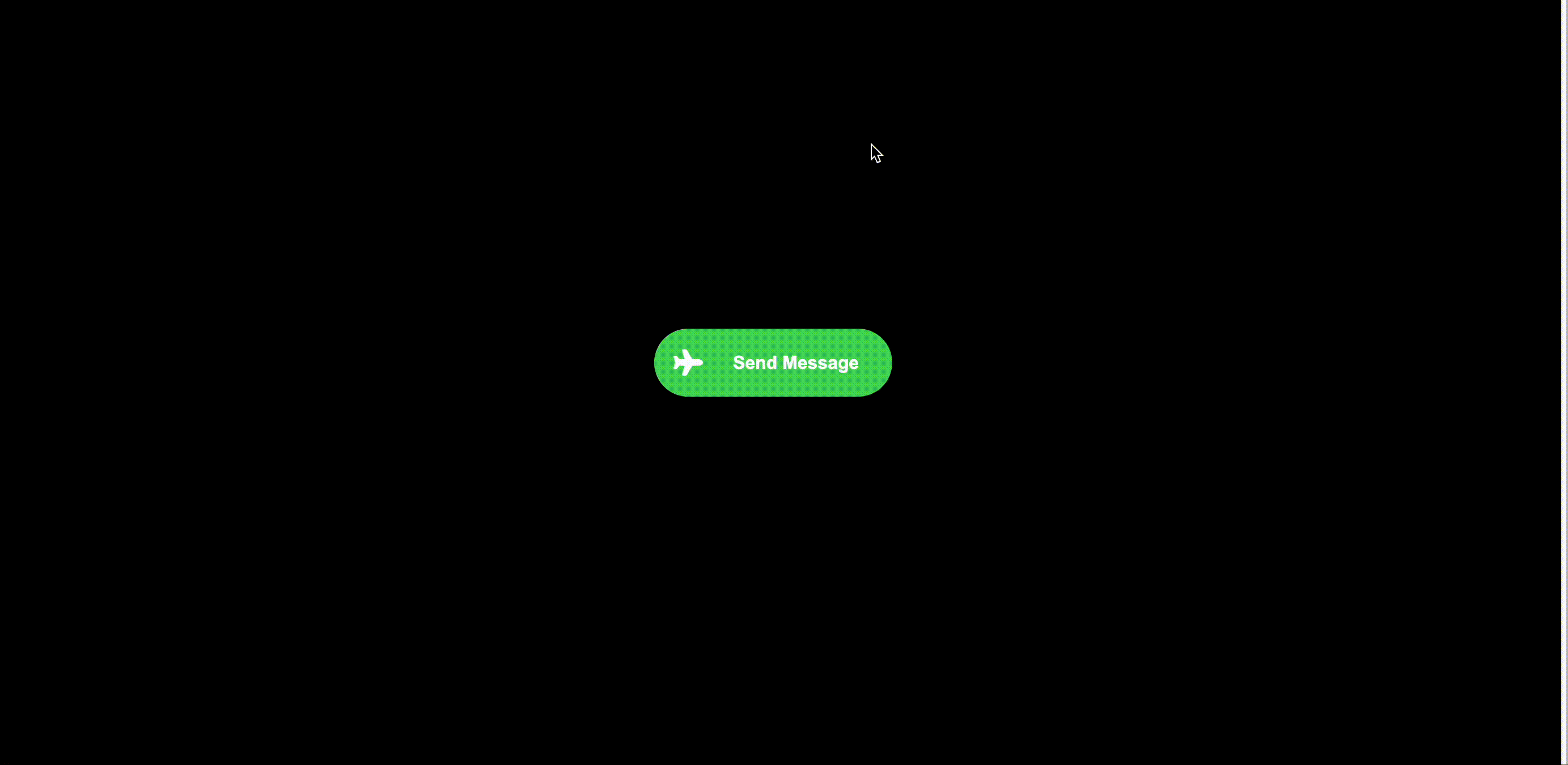
<button class="btn">
<i class="fa-solid fa-plane"></i>
<span class="text">
Send Message
</span>
<span class="loading-animate"></span>
</button>
</body>
</html>body {
display: grid;
place-items: center;
height: 100vh;
background: #000;
}
.btn {
background: #49D75C;
border: none;
outline: none;
cursor: pointer;
border-radius: 35px;
font-size: 1rem;
font-weight: bold;
color: #FFF;
display: grid;
place-items: center;
transition: all 0.25s ease;
position: relative;
width: 210px;
height: 60px;
overflow: hidden;
}
.btn i {
font-size: 1.45rem;
position: absolute;
left: 0px;
pointer-events: none;
z-index: 10;
background: inherit;
width: 60px;
height: 60px;
display: grid;
place-items: center;
border-radius: 50%;
transition: all 0.25s ease;
}
.btn .text {
width: 130px;
display: block;
position: relative;
pointer-events: none;
transition: all 0.25s ease;
position: absolute;
left: 60px;
}
.loading-animate {
position: absolute;
width: 60px;
height: 60px;
z-index: 100;
border-radius: 50%;
top: 0;
left: 0;
display: grid;
place-items: center;
pointer-events: none;
opacity: 0;
transition: all 0.25s ease;
}
.loading-animate::after {
content: "";
width: 44px;
height: 44px;
border-radius: 50%;
border: 3px solid transparent;
border-left: 3px solid #FFF;
animation: loading infinite 0.8s ease 0.05s;
position: absolute;
}
.loading-animate::before {
content: "";
width: 44px;
height: 44px;
border-radius: 50%;
border: 3px solid transparent;
border-left: 3px solid #FFF;
animation: loading infinite 0.8s linear;
position: absolute;
opacity: 0.6;
}
.btn.loading {
width: 60px;
}
.btn.loading i {
transform: rotate(-90deg);
padding-bottom: 4px;
padding-left: 3px;
}
.btn.loading .text {
transform: translate(-140px);
}
.btn.loading .loading-animate {
opacity: 1;
}
@keyframes loading {
0% {
transform: rotate(0deg);
}
100% {
transform: rotate(360deg);
}
}document.querySelector(".btn").addEventListener("click", (evt) => {
evt.target.classList.add("loading");
setTimeout(() => {
evt.target.classList.remove("loading");
}, 3000);
});728x90
LIST
'HTML _CSS' 카테고리의 다른 글
| Neon Love (0) | 2023.02.10 |
|---|---|
| Confetti Text Effect (0) | 2023.02.09 |
| Bouncing Ball (0) | 2023.02.07 |
| Pulse effect on button hover (0) | 2023.02.06 |
| Cocacola (0) | 2023.02.05 |
'HTML _CSS' Related Articles
more


