
250x250
Notice
Recent Posts
Recent Comments
Link
| 일 | 월 | 화 | 수 | 목 | 금 | 토 |
|---|---|---|---|---|---|---|
| 1 | 2 | 3 | ||||
| 4 | 5 | 6 | 7 | 8 | 9 | 10 |
| 11 | 12 | 13 | 14 | 15 | 16 | 17 |
| 18 | 19 | 20 | 21 | 22 | 23 | 24 |
| 25 | 26 | 27 | 28 | 29 | 30 | 31 |
Tags
- php
- 백엔드
- iOS 개발자
- Animation
- SWIFT
- CSS
- 비전공자
- html5
- IOS
- javascript
- 개발자
- effect
- iPhone
- 애니메이션
- jQuery
- 자바스크립트
- front-end
- 프론트엔드
- HTML
- hover
- 풀스택
- 비전공 개발자
- button
- css3
- react
- xcode
- keyframes
- MAC
- image
- ipad
Archives
- Today
- Total
비전공자 개발일기
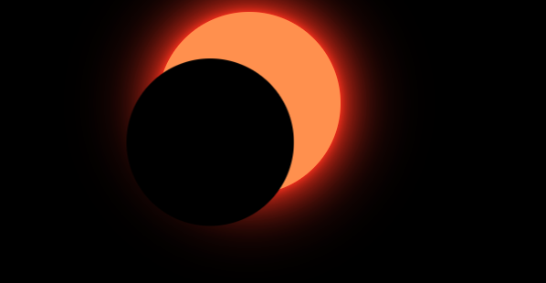
SOLAR Eclipse 본문
728x90
SMALL
<!DOCTYPE html>
<html lang="ko">
<head>
    <meta charset="UTF-8">
    <meta http-equiv="X-UA-Compatible" content="IE=edge">
    <meta name="viewport" content="width=device-width, initial-scale=1.0">
    <title>SOLAR ECLIPSE</title>
    <link rel="stylesheet" href="style.css">
</head>
<body>
    <div class="circle"></div>
</body>
</html>
* {
margin: 0;
padding: 0;
box-sizing: border-box;
}
body {
background-color: #000;
height: 50vh;
display: grid;
place-items: center;
}
.circle {
width: 200px;
height: 200px;
border-radius: 50%;
background-color: #FF9540;
position: relative;
box-shadow: 0 0 10px #FF4500, 0 0 40px #FF4500, 0 0 80px #FF4500;
}
.circle::before {
content: "";
position: absolute;
width: 200px;
height: 200px;
border-radius: 50%;
background-color: #000;
animation: animate 3s linear infinite alternate;
}
@keyframes animate {
0% {
transform: translate(-50px, 50px) scale(0.9);
}
50%, 75% {
transform: translate(0px, 0px) scale(1.02);
box-shadow: 0 0 10px #F9F3F2 0 0 80px 8px #C79388;
}
100% {
transform: translate(50px, -50px) scale(0.9);
box-shadow: none;
}
}728x90
LIST
'HTML _CSS' 카테고리의 다른 글
| 3D Neon Cube (0) | 2022.10.28 |
|---|---|
| Unfold CSS Effect (0) | 2022.10.27 |
| Abstract BG Generator with anime.js (0) | 2022.10.25 |
| Light 3D Cube (0) | 2022.10.24 |
| Candle Animation (0) | 2022.10.22 |
'HTML _CSS' Related Articles
more


