HTML _CSS
Pendulum Loading
HiroDaegu
2023. 1. 23. 22:25
728x90
SMALL

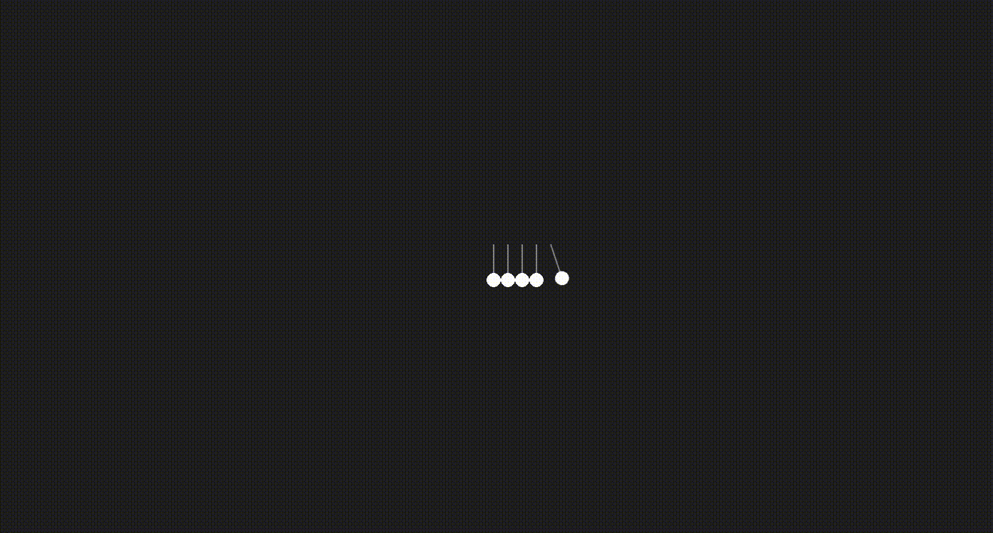
<!DOCTYPE html>
<html lang="en">
<head>
    <meta charset="UTF-8">
    <meta http-equiv="X-UA-Compatible" content="IE=edge">
    <meta name="viewport" content="width=device-width, initial-scale=1.0">
    <title>PENDULUM LOADING</title>
    <link rel="stylesheet" href="style.css">
</head>
<body>
    <div class="loader"></div>
</body>
</html>
* {
margin: 0;
padding: 0;
box-sizing: border-box;
}
body {
background-color: #222;
display: flex;
justify-content: center;
align-items: center;
min-height: 100vh;
}
.loader {
position: relative;
width: 60px;
height: 60px;
display: inline-block;
background: radial-gradient(ellipse at center, #FFF 69%, rgba(0, 0, 0, 0) 70%), linear-gradient(to right, rgba(0, 0, 0, 0) 47%, #FFF 48%, #FFF 52%, rgba(0, 0, 0, 0) 53%);
background-size: 20px 20px, 20px auto;
background-repeat: repeat-x;
background-position: center bottom, center -5px;
}
.loader::before, .loader::after {
content: '';
position: absolute;
top: 0;
left: -20px;
width: 20px;
height: 60px;
background: radial-gradient(ellipse at center, #FFF 69%, rgba(0, 0, 0, 0) 70%), linear-gradient(to right, rgba(0, 0, 0, 0) 47%, #FFF 48%, #FFF 52%, rgba(0, 0, 0, 0) 53%);
background-size: 20px 20px, 20px auto;
background-repeat: no-repeat;
background-position: center bottom, center -5px;
transform: rotate(0);
transform-origin: 50% 0;
animation: move-left 1s linear infinite alternate;
}
.loader::after {
animation: move-right 1s linear infinite alternate;
left: 100%;
}
@keyframes move-left {
0% {
transform: rotate(22deg);
}
50% {
transform: rotate(0);
}
}
@keyframes move-right {
0%, 55% {
transform: rotate(0);
}
100% {
transform: rotate(-22deg);
}
}728x90
LIST