
250x250
Notice
Recent Posts
Recent Comments
Link
| 일 | 월 | 화 | 수 | 목 | 금 | 토 |
|---|---|---|---|---|---|---|
| 1 | 2 | |||||
| 3 | 4 | 5 | 6 | 7 | 8 | 9 |
| 10 | 11 | 12 | 13 | 14 | 15 | 16 |
| 17 | 18 | 19 | 20 | 21 | 22 | 23 |
| 24 | 25 | 26 | 27 | 28 | 29 | 30 |
Tags
- xcode
- javascript
- front-end
- image
- effect
- html5
- 개발자
- keyframes
- 애니메이션
- 풀스택
- HTML
- css3
- 프론트엔드
- php
- CSS
- react
- 자바스크립트
- jQuery
- ipad
- 백엔드
- 비전공 개발자
- Animation
- button
- iPhone
- 비전공자
- iOS 개발자
- SWIFT
- hover
- IOS
- MAC
Archives
- Today
- Total
비전공자 개발일기
Instagram Notification Animation 본문
728x90
SMALL

<!DOCTYPE html>
<html lang="en">
<head>
<meta charset="UTF-8">
<meta http-equiv="X-UA-Compatible" content="IE=edge">
<meta name="viewport" content="width=device-width, initial-scale=1.0">
<title>INSTAGRAM NOTIFICATION ANIMATION</title>
<link rel="stylesheet" href="style.css">
<link
rel="stylesheet"
href="https://cdnjs.cloudflare.com/ajax/libs/font-awesome/5.8.2/css/all.min.css"
/>
</head>
<body>
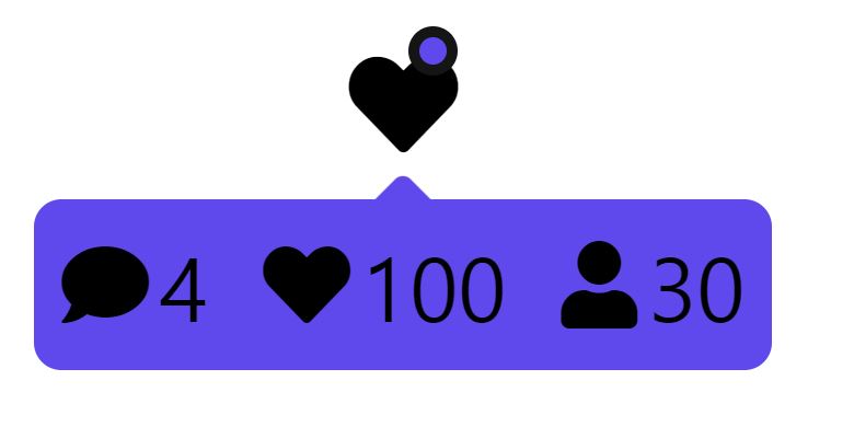
<div class="notification-wrapper">
<span class="heart-icon">
<i class="fas fa-heart"></i>
</span>
<div class="notification">
<span class="notification_item">
<i class="fas fa-comment"></i> 4
</span>
<span class="notification_item">
<i class="fas fa-heart"></i> 100
</span>
<span class="notification_item">
<i class="fas fa-user"></i> 30
</span>
</div>
</div>
</body>
</html>.notification-wrapper {
width: fit-content;
text-align: center;
}
.heart-icon {
font-size: 20px;
position: relative;
}
.heart-icon::after {
content: " ";
position: absolute;
inset: 0 0 auto auto;
width: 5px;
height: 5px;
background-color: #5f49ec;
border: 2px solid #151515;
border-radius: 50%;
opacity: 0;
transform: scale(0);
transition: transform .5s linear, opacity .5s;
}
.notification {
display: flex;
gap: 10px;
background-color: #5f49ec;
padding: 5px;
border-radius: 5px;
margin-top:5px;
position: relative;
opacity: 0;
transform: scale(0);
transform-origin: top;
transition: transform .5s linear, opacity .5s;
}
.notification::after {
content: " ";
position: absolute;
inset: -3px auto auto 50%;
transform: translateX(-50%) rotate(45deg);
width: 10px;
height: 10px;
background-color: inherit;
border-radius: 2px;
z-index: -1;
}
.notification_item {
display: flex;
align-items: center;
column-gap: 2px;
}
.notification-wrapper:hover .heart-icon::after,
.notification-wrapper:hover .notification {
opacity: 1;
transform: scale(1);
}728x90
LIST
'HTML _CSS' 카테고리의 다른 글
| 3D BUTTON (0) | 2022.05.09 |
|---|---|
| Floating Text (0) | 2022.05.07 |
| Card With Glass Effect (0) | 2022.05.03 |
| Neon Text Glow Animation (0) | 2022.05.01 |
| Scanner Animation (0) | 2022.04.30 |
'HTML _CSS' Related Articles
more


