
250x250
Notice
Recent Posts
Recent Comments
Link
| 일 | 월 | 화 | 수 | 목 | 금 | 토 |
|---|---|---|---|---|---|---|
| 1 | 2 | 3 | 4 | 5 | 6 | |
| 7 | 8 | 9 | 10 | 11 | 12 | 13 |
| 14 | 15 | 16 | 17 | 18 | 19 | 20 |
| 21 | 22 | 23 | 24 | 25 | 26 | 27 |
| 28 | 29 | 30 | 31 |
Tags
- 애니메이션
- 풀스택
- keyframes
- javascript
- button
- ipad
- react
- css3
- CSS
- html5
- 프론트엔드
- IOS
- 개발자
- xcode
- Animation
- HTML
- front-end
- php
- 비전공 개발자
- 자바스크립트
- image
- 비전공자
- effect
- hover
- MAC
- iPhone
- SWIFT
- 백엔드
- jQuery
- iOS 개발자
Archives
- Today
- Total
비전공자 개발일기
Glowing Checkbox UI 본문
728x90
SMALL
<!DOCTYPE html>
<html lang="ko">
<head>
<meta charset="UTF-8">
<meta http-equiv="X-UA-Compatible" content="IE=edge">
<meta name="viewport" content="width=device-width, initial-scale=1.0">
<title>GLOWING CHECKBOX UI</title>
<link rel="stylesheet" href="style.css">
<link rel="stylesheet" href="https://stackpath.bootstrapcdn.com/font-awesome/4.7.0/css/font-awesome.min.css"></head>
<body>
<ul>
<li>
<label>
<input type="checkbox" name="">
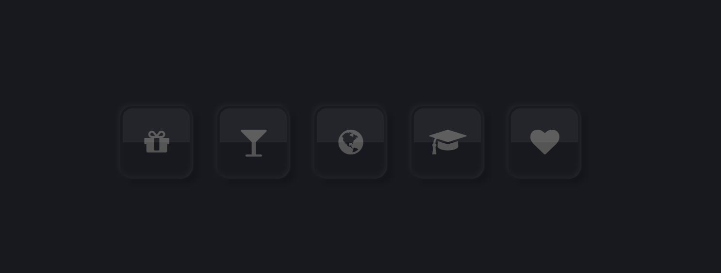
<div class="icon"><i class="fa fa-gift" aria-hidden="true"></i></div>
</label>
</li>
<li>
<label>
<input type="checkbox" name="">
<div class="icon"><i class="fa fa-glass" aria-hidden="true"></i></div>
</label>
</li>
<li>
<label>
<input type="checkbox" name="">
<div class="icon"><i class="fa fa-globe" aria-hidden="true"></i></div>
</label>
</li>
<li>
<label>
<input type="checkbox" name="">
<div class="icon"><i class="fa fa-graduation-cap" aria-hidden="true"></i></div>
</label>
</li>
<li>
<label>
<input type="checkbox" name="">
<div class="icon"><i class="fa fa-heart" aria-hidden="true"></i></div>
</label>
</li>
</ul>
</body>
</html>* {
margin: 0;
padding: 0;
box-sizing: border-box;
list-style: none;
}
body {
display: flex;
justify-content: center;
align-items: center;
min-height: 100vh;
background-color: #18191F;
}
ul {
position: relative;
display: flex;
}
ul li label {
position: relative;
}
ul li label input[type="checkbox"] {
position: absolute;
opacity: 0;
cursor: pointer;
}
ul li label .icon {
position: relative;
width: 60px;
height: 60px;
background-color: #18191F;
color: #555;
font-size: 24px;
display: flex;
justify-content: center;
align-items: center;
cursor: pointer;
margin: 0 10px;
border-radius: 10px;
overflow: hidden;
box-shadow: -1px -1px 4px rgba(255, 255, 255, .05), 4px 4px 6px rgba(0, 0, 0, .2), inset -1px -1px 4px rgba(255, 255, 255, .05), inset 1px 1px 1px rgba(0, 0, 0, .1);
}
ul li label .icon:before {
content: '';
position: absolute;
top: 2px;
left: 2px;
width: calc(100% - 5px);
height: calc(50% - 2px);
border-top-left-radius: 8px;
border-top-right-radius: 8px;
background-color: rgba(255, 255, 255, .05);
}
ul li label input[type="checkbox"]:checked ~ .icon {
box-shadow: inset 0 0 2px rgba(255, 255, 255, .05), inset 4px 4px 6px rgba(0, 0, 0, .2);
}
ul li label input[type="checkbox"]:checked ~ .icon .fa {
color: #00F3FF;
text-shadow: 0 0 15px #00F3FF, 0 0 25px #00F3FF;
animation: animate 5s linear infinite;
}
@keyframes animate {
0% {
filter: hue-rotate(0deg);
}
100% {
filter: hue-rotate(360deg);
}
}728x90
LIST
'HTML _CSS' 카테고리의 다른 글
| Navigation Tabs Menu Design (0) | 2022.08.19 |
|---|---|
| Glowing Ring Animation (0) | 2022.08.17 |
| Shooting Star Animation (0) | 2022.08.15 |
| Fingerprint Scanner Animation (0) | 2022.08.13 |
| Responsive Vertical Timeline (0) | 2022.08.11 |
'HTML _CSS' Related Articles
more


