
250x250
Notice
Recent Posts
Recent Comments
Link
| 일 | 월 | 화 | 수 | 목 | 금 | 토 |
|---|---|---|---|---|---|---|
| 1 | ||||||
| 2 | 3 | 4 | 5 | 6 | 7 | 8 |
| 9 | 10 | 11 | 12 | 13 | 14 | 15 |
| 16 | 17 | 18 | 19 | 20 | 21 | 22 |
| 23 | 24 | 25 | 26 | 27 | 28 | 29 |
| 30 |
Tags
- ipad
- iPhone
- 비전공자
- image
- button
- react
- xcode
- 개발자
- javascript
- 애니메이션
- SWIFT
- MAC
- 자바스크립트
- CSS
- IOS
- 백엔드
- 풀스택
- 비전공 개발자
- html5
- php
- hover
- css3
- jQuery
- Animation
- keyframes
- 프론트엔드
- front-end
- HTML
- iOS 개발자
- effect
Archives
- Today
- Total
비전공자 개발일기
Glowing Ring Animation 본문
728x90
SMALL
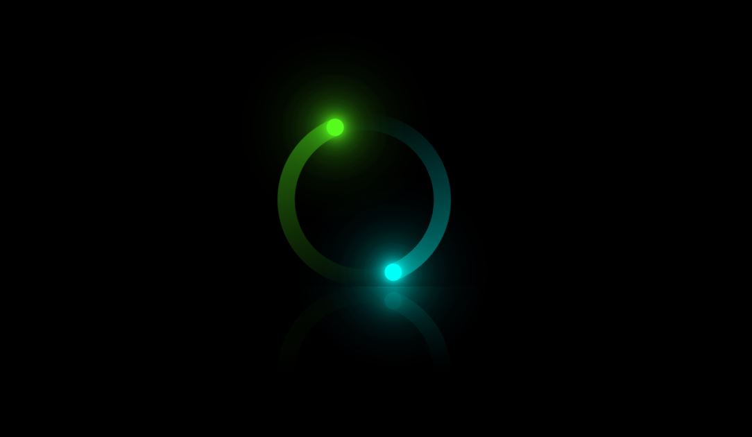
<!DOCTYPE html>
<html lang="ko">
<head>
  <meta charset="UTF-8">
  <meta http-equiv="X-UA-Compatible" content="IE=edge">
  <meta name="viewport" content="width=device-width, initial-scale=1.0">
  <title>GLOWING RING ANIMATION</title>
  <link rel="stylesheet" href="style.css">
</head>
<body>
  <div class="container">
    <div class="loader"><span></span></div>
    <div class="loader"><span></span></div>
    <div class="loader"><i></i></div>
    <div class="loader"><i></i></div>
  </div>
</body>
</html>
* {
margin: 0;
padding: 0;
box-sizing: border-box;
}
body {
display: flex;
justify-content: center;
align-items: center;
min-height: 100vh;
background-color: #000;
}
.container {
position: relative;
width: 100%;
height: 200px;
display: flex;
justify-content: center;
align-items: center;
-webkit-box-reflect: below 0 linear-gradient(transparent, transparent, #0005);
}
.container .loader {
position: absolute;
width: 200px;
height: 200px;
border-radius: 50%;
animation: animate 2s linear infinite;
}
.container .loader:nth-child(2), .container .loader:nth-child(4) {
animation-delay: -1s;
filter: hue-rotate(290deg);
}
@keyframes animate {
0% {
transform: rotate(0deg);
}
100% {
transform: rotate(360deg);
}
}
.container .loader:nth-child(1)::before, .container .loader:nth-child(2)::before {
content: '';
position: absolute;
top: 0;
left: 0;
width: 50%;
height: 100%;
background: linear-gradient(to top, transparent, rgba(0, 255, 249, .4));
background-size: 100px 189px;
background-repeat: no-repeat;
border-top-left-radius: 100px;
border-bottom-left-radius: 100px;
}
.container .loader span {
position: absolute;
inset: 20px;
background-color: #000;
border-radius: 50%;
z-index: 1;
}
.container .loader i {
position: absolute;
top: 0;
left: 50%;
transform: translateX(-50%);
width: 20px;
height: 20px;
background: #00FFF9;
border-radius: 50%;
z-index: 100;
box-shadow: 0 0 10px #00FFF9, 0 0 20px #00FFF9, 0 0 30px #00FFF9, 0 0 40px #00FFF9, 0 0 50px #00FFF9, 0 0 60px #00FFF9, 0 0 70px #00FFF9, 0 0 80px #00FFF9, 0 0 90px #00FFF9, 0 0 100px #00FFF9;
}728x90
LIST
'HTML _CSS' 카테고리의 다른 글
| Responsive Pricing Table (0) | 2022.08.20 |
|---|---|
| Navigation Tabs Menu Design (0) | 2022.08.19 |
| Glowing Checkbox UI (0) | 2022.08.16 |
| Shooting Star Animation (0) | 2022.08.15 |
| Fingerprint Scanner Animation (0) | 2022.08.13 |
'HTML _CSS' Related Articles
more


