
250x250
Notice
Recent Posts
Recent Comments
Link
| 일 | 월 | 화 | 수 | 목 | 금 | 토 |
|---|---|---|---|---|---|---|
| 1 | ||||||
| 2 | 3 | 4 | 5 | 6 | 7 | 8 |
| 9 | 10 | 11 | 12 | 13 | 14 | 15 |
| 16 | 17 | 18 | 19 | 20 | 21 | 22 |
| 23 | 24 | 25 | 26 | 27 | 28 | 29 |
| 30 |
Tags
- ipad
- 개발자
- css3
- iOS 개발자
- SWIFT
- hover
- 프론트엔드
- php
- MAC
- jQuery
- html5
- 애니메이션
- react
- 비전공 개발자
- CSS
- effect
- iPhone
- HTML
- 백엔드
- 자바스크립트
- front-end
- 풀스택
- Animation
- image
- javascript
- button
- keyframes
- 비전공자
- xcode
- IOS
Archives
- Today
- Total
비전공자 개발일기
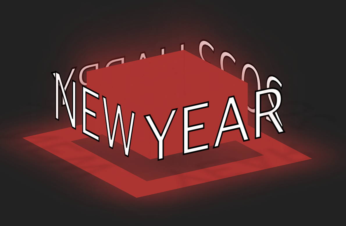
3D Happy New Year 본문
728x90
SMALL
<!DOCTYPE html>
<html lang="ko">

<head>
    <meta charset="UTF-8">
    <meta http-equiv="X-UA-Compatible" content="IE=edge">
    <meta name="viewport" content="width=device-width, initial-scale=1.0">
    <title>3D 2023</title>
    <link rel="stylesheet" href="style.css">
</head>

<body>
    <div class="box">
        <div class="block">
            <span style="--i:0;"></span>
            <span style="--i:1;"></span>
            <span style="--i:2;"></span>
            <span style="--i:3;"></span>
        </div>
        <div class="text">
            <span style="--i:0;" data-text="Happy">Happy</span>
            <span style="--i:1;" data-text="New">New</span>
            <span style="--i:2;" data-text="Year">Year</span>
            <span style="--i:3;" data-text="2023">2023</span>
        </div>
    </div>
</body>

</html>
* {
margin: 0;
padding: 0;
box-sizing: border-box;
position: relative;
}
body {
min-height: 100vh;
display: flex;
justify-content: center;
align-items: center;
background-color: #222;
}
.box {
height: 200px;
transform-style: preserve-3d;
animation: animate 16s linear infinite;
}
@keyframes animate {
0% {
transform: rotateX(-20deg) rotateY(360deg);
}
100% {
transform: rotateX(-20deg) rotateY(0);
}
}
.box div {
position: absolute;
inset: 0;
transform-style: preserve-3d;
}
.box div.block span {
position: absolute;
left: calc(50% - 100px);
width: 200px;
height: 100px;
background-color: #444;
transform: rotateY(calc(90deg * var(--i))) translateZ(100px);
transition: .5s;
}
.box:hover div.block span {
background-color: #BB2429;
filter: drop-shadow(0 0 50px #BB2429);
}
.box div.text span {
position: absolute;
width: 100%;
height: 100px;
display: flex;
justify-content: center;
align-items: center;
transform: rotateY(calc(90deg * var(--i))) translateZ(150px);
cursor: pointer;
color: #FFF;
font-size: 8em;
text-transform: uppercase;
z-index: 10;
line-height: 1em;
-webkit-text-stroke: 3px #000;
transform-style: preserve-3d;
}
.box div.text span:nth-child(1) {
font-size: 6em;
}
.box div.text span::before {
content: attr(data-text);
position: absolute;
bottom: 7px;
transform-origin: bottom;
transform: rotateX(-90deg);
color: rgba(0, 0, 0, .1);
-webkit-text-stroke: 0 #000;
filter: blur(5px);
}
.box div.text span::after {
content: '';
position: absolute;
top: 100px;
width: 360px;
height: 60px;
background-color: #444;
transform: rotateX(-90deg);
transition: .5s;
}
.box:hover div.text span::after {
background-color: #BB2429;
filter: drop-shadow(0 0 50px #BB2429);
}728x90
LIST
'HTML _CSS' 카테고리의 다른 글
| Foggy Rain Animation (0) | 2023.01.06 |
|---|---|
| Dynamic Calendar (0) | 2023.01.05 |
| Starbucks Landing Page (0) | 2023.01.02 |
| Happy New Year 2023 (0) | 2022.12.31 |
| X-mas Background (0) | 2022.12.26 |
'HTML _CSS' Related Articles
more


