
250x250
Notice
Recent Posts
Recent Comments
Link
| 일 | 월 | 화 | 수 | 목 | 금 | 토 |
|---|---|---|---|---|---|---|
| 1 | ||||||
| 2 | 3 | 4 | 5 | 6 | 7 | 8 |
| 9 | 10 | 11 | 12 | 13 | 14 | 15 |
| 16 | 17 | 18 | 19 | 20 | 21 | 22 |
| 23 | 24 | 25 | 26 | 27 | 28 | 29 |
| 30 |
Tags
- 개발자
- html5
- css3
- MAC
- button
- HTML
- 프론트엔드
- IOS
- 자바스크립트
- SWIFT
- javascript
- php
- CSS
- xcode
- iPhone
- Animation
- 비전공 개발자
- effect
- image
- 비전공자
- keyframes
- 애니메이션
- hover
- ipad
- 풀스택
- react
- iOS 개발자
- front-end
- jQuery
- 백엔드
Archives
- Today
- Total
비전공자 개발일기
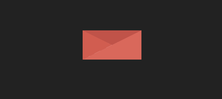
Mail Button Micro-Interaction 본문
728x90
SMALL

<!DOCTYPE html>
<html lang="ko">

<head>
    <meta charset="UTF-8">
    <meta http-equiv="X-UA-Compatible" content="IE=edge">
    <meta name="viewport" content="width=device-width, initial-scale=1.0">
    <title>MAIL BTN MICROINTERACTION</title>
    <link rel="stylesheet" href="style.css">
</head>

<body>
    <main class="wrapper">
        <div class="animated-mail">
            <div class="back-fold"></div>
            <div class="letter">
                <div class="letter-border"></div>
                <div class="letter-title"></div>
                <div class="letter-context"></div>
                <div class="letter-stamp">
                    <div class="letter-stamp-inner"></div>
                </div>
            </div>
            <div class="top-fold"></div>
            <div class="body"></div>
            <div class="left-fold"></div>
        </div>
    </main>
</body>

</html>
body {
display: flex;
justify-content: center;
align-items: center;
min-height: 100vh;
background-color: #222;
}
.wrapper {
width: 200px;
height: 200px;
cursor: pointer;
}
.animated-mail {
position: absolute;
width: 200px;
height: 150px;
transition: .4s;
}
.animated-mail .body {
position: absolute;
bottom: 0;
width: 0;
height: 0;
border-style: solid;
border-width: 0 0 100px 200px;
border-color: transparent transparent #E95F55 transparent;
z-index: 2;
}
.animated-mail .top-fold {
position: absolute;
top: 50px;
width: 0;
height: 0;
border-style: solid;
border-width: 50px 100px 0 100px;
transform-origin: 50% 0;
transition: transform .4s .4s, z-index .2s .4s;
border-color: #CF4A43 transparent transparent transparent;
z-index: 2;
}
.animated-mail .back-fold {
position: absolute;
bottom: 0;
width: 200px;
height: 100px;
background-color: #CF4A43;
z-index: 0;
}
.animated-mail .left-fold {
position: absolute;
bottom: 0;
width: 0;
height: 0;
border-style: solid;
border-width: 50px 0 50px 100px;
border-color: transparent transparent transparent #E15349;
z-index: 2;
}
.animated-mail .letter {
position: absolute;
left: 20px;
bottom: 0;
width: 160px;
height: 60px;
background-color: #FFF;
overflow: hidden;
-webkit-transition: .4s .2s;
-moz-transition: .4s .2s;
transition: .4s .2s;
z-index: 1;
}
.animated-mail .letter .letter-border {
width: 100%;
height: 10px;
background: repeating-linear-gradient(-45deg, #CB5A5E, #CB5A5E 8px, transparent 8px, transparent 10px);
}
.animated-mail .letter .letter-title {
width: 40%;
height: 10px;
background-color: #CB5A5E;
margin: 10px 0 0 5px;
}
.animated-mail .letter .letter-context {
width: 20%;
height: 10px;
background-color: #CB5A5E;
margin: 10px 0 0 5px;
}
.animated-mail .letter .letter-stamp {
width: 30px;
height: 30px;
border-radius: 100%;
margin: 30px 0 0 120px;
background-color: #CB5A5E;
opacity: .3;
}
.wrapper:hover .animated-mail {
transform: translateY(50px);
}
.wrapper:hover .animated-mail .top-fold {
transition: transform .4s, z-index .2s;
transform: rotateX(180deg);
z-index: 0;
}
.wrapper:hover .animated-mail .letter {
height: 180px;
}728x90
LIST
'HTML _CSS' 카테고리의 다른 글
| Intro Text Animation (0) | 2023.01.11 |
|---|---|
| Multi Colored Text (0) | 2023.01.10 |
| Ring Of Fire (0) | 2023.01.08 |
| Animated Progress Bar (0) | 2023.01.07 |
| Foggy Rain Animation (0) | 2023.01.06 |
'HTML _CSS' Related Articles
more


