
250x250
Notice
Recent Posts
Recent Comments
Link
| 일 | 월 | 화 | 수 | 목 | 금 | 토 |
|---|---|---|---|---|---|---|
| 1 | 2 | 3 | 4 | 5 | 6 | |
| 7 | 8 | 9 | 10 | 11 | 12 | 13 |
| 14 | 15 | 16 | 17 | 18 | 19 | 20 |
| 21 | 22 | 23 | 24 | 25 | 26 | 27 |
| 28 | 29 | 30 | 31 |
Tags
- Animation
- xcode
- 프론트엔드
- react
- 백엔드
- 비전공자
- iOS 개발자
- jQuery
- css3
- 애니메이션
- 풀스택
- HTML
- php
- SWIFT
- effect
- javascript
- MAC
- 개발자
- 비전공 개발자
- html5
- button
- keyframes
- front-end
- hover
- IOS
- CSS
- 자바스크립트
- iPhone
- image
- ipad
Archives
- Today
- Total
비전공자 개발일기
Intro Text Animation 본문
728x90
SMALL
<!DOCTYPE html>
<html lang="ko">
<head>
<meta charset="UTF-8">
<meta http-equiv="X-UA-Compatible" content="IE=edge">
<meta name="viewport" content="width=device-width, initial-scale=1.0">
<title>INTRO TEXT ANIMATION</title>
<link rel="stylesheet" href="style.css">
</head>
<body>
<section>
<div class="box">
<div class="textBox">
<div class="text">
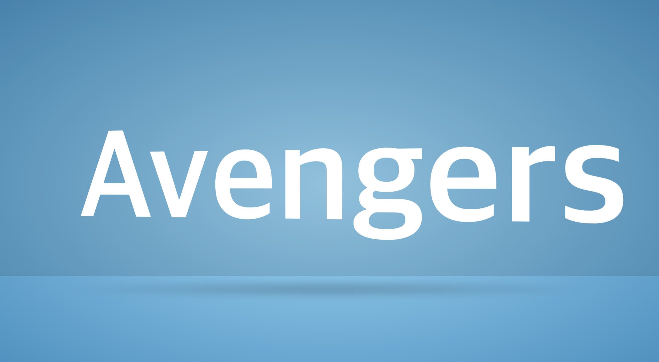
<h2>Avengers</h2>
</div>
<div class="text">
<h2>Assemble</h2>
</div>
</div>
<div class="shadow"></div>
</div>
</section>
</body>
</html>* {
margin: 0;
padding: 0;
box-sizing: border-box;
position: relative;
}
body {
background: radial-gradient(#93D9F9, #0C80B5);
min-height: 100vh;
overflow: hidden;
}
body::before {
content: '';
position: absolute;
top: 0;
left: 0;
width: 100%;
height: 70vh;
background-color: rgba(0, 0, 0, .1);
}
section {
display: flex;
justify-content: center;
align-items: center;
min-height: 100vh;
transform-style: preserve-3d;
perspective: 1000px;
}
.box {
width: 100%;
transform-style: preserve-3d;
animation: textEntry 6s linear infinite;
}
@keyframes textEntry {
0%, 5% {
transform: translateZ(1500px);
}
15%, 95% {
transform: translateZ(0);
}
100% {
transform: translateZ(1500px);
}
}
.textBox {
width: 100%;
height: 400px;
transform-style: preserve-3d;
animation: animate 2s linear infinite;
animation-delay: .75s;
}
@keyframes animate {
0% {
transform: rotateY(360deg);
}
100% {
transform: rotateY(0);
}
}
.shadow {
position: absolute;
left: 50%;
bottom: 0;
transform: translateX(-50%);
width: 100%;
height: 50px;
background: radial-gradient(rgba(0, 0, 0, .2), transparent, transparent);
filter: blur(5px);
animation: animateShadow 1s linear infinite;
animation-delay: .75s;
}
@keyframes animateShadow {
0%, 100% {
transform: translateX(-50%) scale(1);
}
50% {
transform: translateX(-50%) scale(0.2);
}
}
.textBox .text {
position: absolute;
top: 0;
right: 0;
bottom: 0;
left: 0;
display: flex;
justify-content: center;
align-items: center;
backface-visibility: hidden;
}
.textBox .text:nth-child(2) {
transform: rotateY(180deg);
}
.textBox .text h2 {
font-size: 16vw;
color: #FFF;
}728x90
LIST
'HTML _CSS' 카테고리의 다른 글
| Animated Service Section Card UI (0) | 2023.01.13 |
|---|---|
| Skeleton Screen (0) | 2023.01.12 |
| Multi Colored Text (0) | 2023.01.10 |
| Mail Button Micro-Interaction (0) | 2023.01.09 |
| Ring Of Fire (0) | 2023.01.08 |
'HTML _CSS' Related Articles
more


