
250x250
Notice
Recent Posts
Recent Comments
Link
| 일 | 월 | 화 | 수 | 목 | 금 | 토 |
|---|---|---|---|---|---|---|
| 1 | 2 | 3 | 4 | 5 | 6 | |
| 7 | 8 | 9 | 10 | 11 | 12 | 13 |
| 14 | 15 | 16 | 17 | 18 | 19 | 20 |
| 21 | 22 | 23 | 24 | 25 | 26 | 27 |
| 28 | 29 | 30 | 31 |
Tags
- jQuery
- javascript
- 풀스택
- iOS 개발자
- ipad
- button
- 프론트엔드
- 백엔드
- php
- hover
- SWIFT
- CSS
- 애니메이션
- iPhone
- 비전공 개발자
- html5
- IOS
- image
- 자바스크립트
- react
- 개발자
- MAC
- effect
- front-end
- xcode
- css3
- Animation
- HTML
- 비전공자
- keyframes
Archives
- Today
- Total
비전공자 개발일기
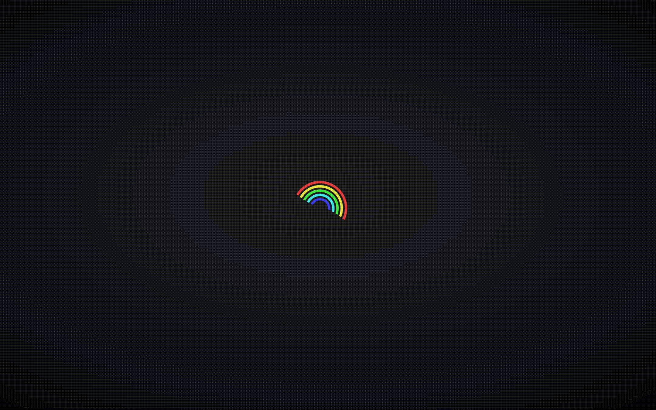
Rainbow Loader 본문
728x90
SMALL

<!DOCTYPE html>
<html lang="ko">

<head>
    <meta charset="UTF-8">
    <meta http-equiv="X-UA-Compatible" content="IE=edge">
    <meta name="viewport" content="width=device-width, initial-scale=1.0">
    <title>RAINBOW LOADER</title>
    <link rel="stylesheet" href="style.css">
</head>

<body>
    <div class="loader">
        <div class="loader-inner">
            <div class="loader-line-wrap">
                <div class="loader-line"></div>
            </div>
            <div class="loader-line-wrap">
                <div class="loader-line"></div>
            </div>
            <div class="loader-line-wrap">
                <div class="loader-line"></div>
            </div>
            <div class="loader-line-wrap">
                <div class="loader-line"></div>
            </div>
            <div class="loader-line-wrap">
                <div class="loader-line"></div>
            </div>
        </div>
    </div>
</body>

</html>
* {
margin: 0;
padding: 0;
box-sizing: border-box;
}
body {
display: flex;
justify-content: center;
align-items: center;
min-height: 100vh;
background: radial-gradient(#222, #000);
}
.loader-inner {
width: 100px;
height: 60px;
margin: auto;
position: absolute;
inset: 0;
}
.loader-line-wrap {
animation: spin 2000ms cubic-bezier(0.175, 0.885, 0.32, 1.275) infinite;
width: 100px;
height: 50px;
left: 0;
overflow: hidden;
position: absolute;
top: 0;
transform-origin: 50% 100%;
}
.loader-line {
border: 4px solid transparent;
border-radius: 100%;
width: 100px;
height: 100px;
margin: 0 auto;
position: absolute;
inset: 0;
}
.loader-line-wrap:nth-child(1) {
animation-delay: -50ms;
}
.loader-line-wrap:nth-child(2) {
animation-delay: -100ms;
}
.loader-line-wrap:nth-child(3) {
animation-delay: -150ms;
}
.loader-line-wrap:nth-child(4) {
animation-delay: -200ms;
}
.loader-line-wrap:nth-child(5) {
animation-delay: -250ms;
}
.loader-line-wrap:nth-child(1) .loader-line {
border-color: #EB4747;
height: 90px;
width: 90px;
top: 7px;
}
.loader-line-wrap:nth-child(2) .loader-line {
border-color: #EBEB47;
height: 76px;
width: 76px;
top: 14px;
}
.loader-line-wrap:nth-child(3) .loader-line {
border-color: #47EB47;
height: 62px;
width: 62px;
top: 21px;
}
.loader-line-wrap:nth-child(4) .loader-line {
border-color: #47EBEB;
height: 48px;
width: 48px;
top: 28px;
}
.loader-line-wrap:nth-child(5) .loader-line {
border-color: #4747EB;
height: 34px;
width: 34px;
top: 35px;
}
@keyframes spin {
0%,
15% {
transform: rotate(0);
}
100% {
transform: rotate(360deg);
}
}728x90
LIST
'HTML _CSS' 카테고리의 다른 글
| Bubbles on Button Clicked (0) | 2023.01.31 |
|---|---|
| Police VS Taxi (0) | 2023.01.30 |
| Star Rating (0) | 2023.01.28 |
| Fill Glass Loader (0) | 2023.01.27 |
| Ghost Loader (0) | 2023.01.26 |
'HTML _CSS' Related Articles
more


