
250x250
Notice
Recent Posts
Recent Comments
Link
| 일 | 월 | 화 | 수 | 목 | 금 | 토 |
|---|---|---|---|---|---|---|
| 1 | ||||||
| 2 | 3 | 4 | 5 | 6 | 7 | 8 |
| 9 | 10 | 11 | 12 | 13 | 14 | 15 |
| 16 | 17 | 18 | 19 | 20 | 21 | 22 |
| 23 | 24 | 25 | 26 | 27 | 28 | 29 |
| 30 |
Tags
- javascript
- SWIFT
- HTML
- 프론트엔드
- Animation
- IOS
- keyframes
- hover
- css3
- iOS 개발자
- front-end
- 백엔드
- php
- button
- image
- xcode
- 애니메이션
- 자바스크립트
- jQuery
- 개발자
- 풀스택
- react
- 비전공자
- MAC
- 비전공 개발자
- CSS
- effect
- html5
- ipad
- iPhone
Archives
- Today
- Total
비전공자 개발일기
Bubbles on Button Clicked 본문
728x90
SMALL
<!DOCTYPE html>
<html lang="ko">
<head>
<meta charset="UTF-8">
<meta http-equiv="X-UA-Compatible" content="IE=edge">
<meta name="viewport" content="width=device-width, initial-scale=1.0">
<title>Document</title>
<link rel="stylesheet" href="style.css">
<script defer src="main.js"></script>
</head>
<body>
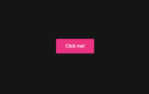
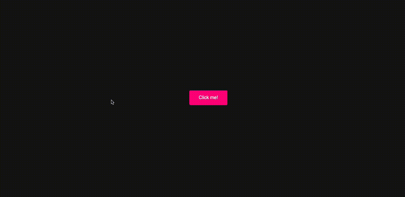
<button class="bubbly-button">Click me!</button>
</body>
</html>*,
*::before,
*::after {
box-sizing: border-box;
margin: 0;
padding: 0;
}
body {
min-height: 100vh;
display: grid;
place-items: center;
background: #151515;
}
.bubbly-button {
display: inline-block;
font-size: 1em;
padding: 1em 2em;
margin-top: 100px;
margin-bottom: 60px;
-webkit-appearance: none;
appearance: none;
background-color: #ff0081;
color: #fff;
border-radius: 4px;
border: none;
cursor: pointer;
position: relative;
transition: transform ease-in 0.1s, box-shadow ease-in 0.25s;
}
.bubbly-button::before,
.bubbly-button::after {
position: absolute;
content: "";
display: none;
width: 140%;
height: 100%;
left: -20%;
z-index: -1000;
transition: all ease-in-out 0.5s;
background-repeat: no-repeat;
}
.bubbly-button::before {
top: -75%;
background-image: radial-gradient(circle, #ff0081 20%, transparent 20%),
radial-gradient(circle, transparent 20%, #ff0081 20%, transparent 30%),
radial-gradient(circle, #ff0081 20%, transparent 20%),
radial-gradient(circle, #ff0081 20%, transparent 20%),
radial-gradient(circle, transparent 10%, #ff0081 15%, transparent 20%),
radial-gradient(circle, #ff0081 20%, transparent 20%),
radial-gradient(circle, #ff0081 20%, transparent 20%),
radial-gradient(circle, #ff0081 20%, transparent 20%),
radial-gradient(circle, #ff0081 20%, transparent 20%);
background-size: 10% 10%, 20% 20%, 15% 15%, 20% 20%, 18% 18%, 10% 10%, 15% 15%,
10% 10%, 18% 18%;
}
.bubbly-button::after {
bottom: -75%;
background-image: radial-gradient(circle, #ff0081 20%, transparent 20%),
radial-gradient(circle, #ff0081 20%, transparent 20%),
radial-gradient(circle, transparent 10%, #ff0081 15%, transparent 20%),
radial-gradient(circle, #ff0081 20%, transparent 20%),
radial-gradient(circle, #ff0081 20%, transparent 20%),
radial-gradient(circle, #ff0081 20%, transparent 20%),
radial-gradient(circle, #ff0081 20%, transparent 20%);
background-size: 15% 15%, 20% 20%, 18% 18%, 20% 20%, 15% 15%, 10% 10%, 20% 20%;
}
.bubbly-button:active {
transform: scale(0.9);
background-color: #e60074;
box-shadow: 0 2px 25px rgba(255, 0, 130, 0.2);
}
.bubbly-button.animate::before {
display: block;
animation: topBubbles ease-in-out 0.75s forwards;
}
.bubbly-button.animate::after {
display: block;
animation: bottomBubbles ease-in-out 0.75s forwards;
}
@keyframes topBubbles {
0% {
background-position: 5% 90%, 10% 90%, 10% 90%, 15% 90%, 25% 90%, 25% 90%,
40% 90%, 55% 90%, 70% 90%;
}
50% {
background-position: 0% 80%, 0% 20%, 10% 40%, 20% 0%, 30% 30%, 22% 50%,
50% 50%, 65% 20%, 90% 30%;
}
100% {
background-position: 0% 70%, 0% 10%, 10% 30%, 20% -10%, 30% 20%, 22% 40%,
50% 40%, 65% 10%, 90% 20%;
background-size: 0% 0%, 0% 0%, 0% 0%, 0% 0%, 0% 0%, 0% 0%;
}
}
@keyframes bottomBubbles {
0% {
background-position: 10% -10%, 30% 10%, 55% -10%, 70% -10%, 85% -10%,
70% -10%, 70% 0%;
}
50% {
background-position: 0% 80%, 20% 80%, 45% 60%, 60% 100%, 75% 70%, 95% 60%,
105% 0%;
}
100% {
background-position: 0% 90%, 20% 90%, 45% 70%, 60% 110%, 75% 80%, 95% 70%,
110% 10%;
background-size: 0% 0%, 0% 0%, 0% 0%, 0% 0%, 0% 0%, 0% 0%;
}
}var animateButton = function (e) {
e.preventDefault;
//reset animation
e.target.classList.remove("animate");
e.target.classList.add("animate");
setTimeout(function () {
e.target.classList.remove("animate");
}, 700);
};
var bubblyButtons = document.getElementsByClassName("bubbly-button");
for (var i = 0; i < bubblyButtons.length; i++) {
bubblyButtons[i].addEventListener("click", animateButton, false);
}728x90
LIST
'HTML _CSS' 카테고리의 다른 글
| Animated Gender Selection Page Design (0) | 2023.02.02 |
|---|---|
| Shine effect on hover (0) | 2023.02.01 |
| Police VS Taxi (0) | 2023.01.30 |
| Rainbow Loader (0) | 2023.01.29 |
| Star Rating (0) | 2023.01.28 |
'HTML _CSS' Related Articles
more


