
250x250
Notice
Recent Posts
Recent Comments
Link
| 일 | 월 | 화 | 수 | 목 | 금 | 토 |
|---|---|---|---|---|---|---|
| 1 | ||||||
| 2 | 3 | 4 | 5 | 6 | 7 | 8 |
| 9 | 10 | 11 | 12 | 13 | 14 | 15 |
| 16 | 17 | 18 | 19 | 20 | 21 | 22 |
| 23 | 24 | 25 | 26 | 27 | 28 | 29 |
| 30 |
Tags
- html5
- front-end
- button
- iPhone
- SWIFT
- 프론트엔드
- effect
- 개발자
- xcode
- javascript
- image
- 풀스택
- keyframes
- 비전공자
- css3
- Animation
- 애니메이션
- react
- HTML
- jQuery
- php
- ipad
- MAC
- IOS
- CSS
- iOS 개발자
- hover
- 비전공 개발자
- 자바스크립트
- 백엔드
Archives
- Today
- Total
비전공자 개발일기
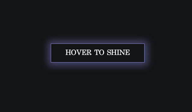
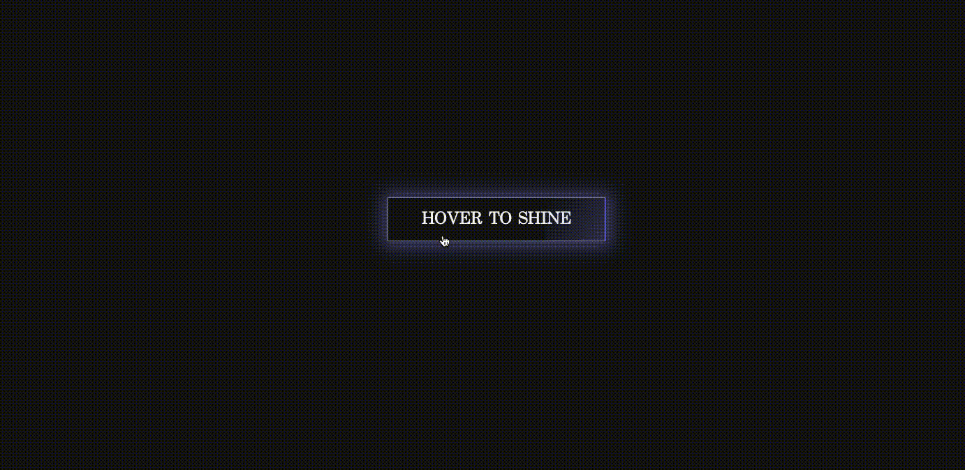
Shine effect on hover 본문
728x90
SMALL
<!DOCTYPE html>
<html lang="ko">
<head>
    <meta charset="UTF-8">
    <meta http-equiv="X-UA-Compatible" content="IE=edge">
    <meta name="viewport" content="width=device-width, initial-scale=1.0">
    <title>SHINE EFFECT ON HOVER</title>
    <link rel="stylesheet" href="style.css">
</head>
<body>
    <a href="#" class="btn">Hover to Shine</a>
</body>
</html>
*,
*::before,
*::after {
box-sizing: border-box;
margin: 0;
padding: 0;
}
body {
min-height: 100vh;
display: grid;
place-items: center;
background: #121314;
font-family: serif;
}
.btn {
font-size: 1.5rem;
padding: 1rem 3rem;
color: #F4F4F4;
text-transform: uppercase;
text-decoration: none;
border: 1px solid rgb(146, 148, 248);
position: relative;
overflow: hidden;
}
.btn:hover {
box-shadow: 1px 1px 25px 10px rgba(146, 148, 248, 0.4);
}
.btn::before {
content: "";
position: absolute;
top: 0;
left: -100%;
width: 100%;
height: 100%;
background: linear-gradient(
120deg,
transparent,
rgba(146, 148, 248, 0.4),
transparent
);
transition: all 650ms;
}
.btn:hover::before {
left: 100%;
}728x90
LIST
'HTML _CSS' 카테고리의 다른 글
| Movie Streaming Website (0) | 2023.02.04 |
|---|---|
| Animated Gender Selection Page Design (0) | 2023.02.02 |
| Bubbles on Button Clicked (0) | 2023.01.31 |
| Police VS Taxi (0) | 2023.01.30 |
| Rainbow Loader (0) | 2023.01.29 |
'HTML _CSS' Related Articles
more


