
250x250
Notice
Recent Posts
Recent Comments
Link
| 일 | 월 | 화 | 수 | 목 | 금 | 토 |
|---|---|---|---|---|---|---|
| 1 | 2 | 3 | 4 | 5 | 6 | |
| 7 | 8 | 9 | 10 | 11 | 12 | 13 |
| 14 | 15 | 16 | 17 | 18 | 19 | 20 |
| 21 | 22 | 23 | 24 | 25 | 26 | 27 |
| 28 | 29 | 30 | 31 |
Tags
- CSS
- 비전공자
- 비전공 개발자
- effect
- MAC
- iPhone
- SWIFT
- Animation
- hover
- 풀스택
- 자바스크립트
- image
- html5
- iOS 개발자
- HTML
- react
- ipad
- keyframes
- jQuery
- javascript
- php
- IOS
- 백엔드
- button
- 프론트엔드
- front-end
- 애니메이션
- xcode
- 개발자
- css3
Archives
- Today
- Total
비전공자 개발일기
Landscape Design 본문
728x90
SMALL
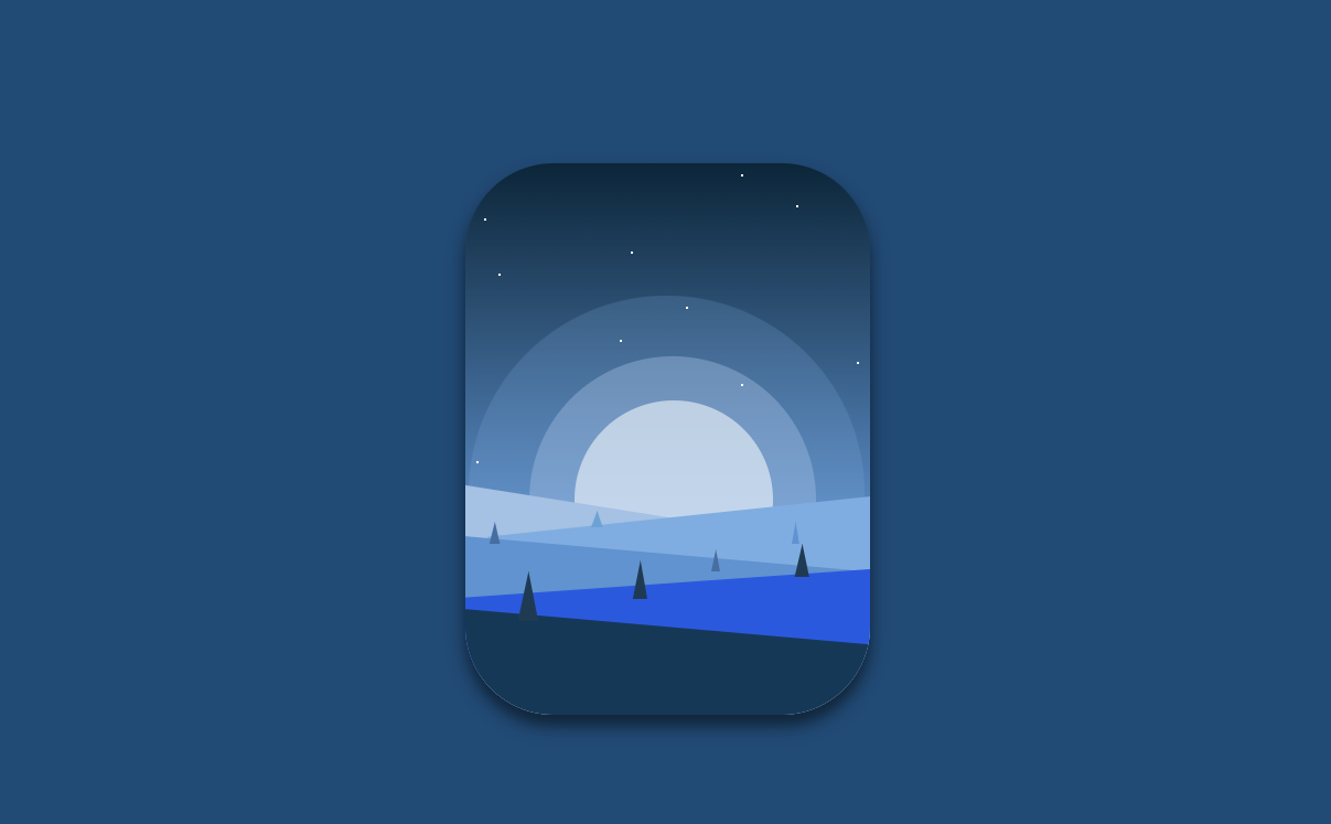
<!DOCTYPE html>
<html lang="ko">

<head>
    <meta charset="UTF-8">
    <meta http-equiv="X-UA-Compatible" content="IE=edge">
    <meta name="viewport" content="width=device-width, initial-scale=1.0">
    <title>LANDSCAPE DESIGN</title>
    <link rel="stylesheet" href="style.css">
</head>

<body>
    <div class="container">
        <div class="disc-1"></div>
        <div class="disc-2"></div>
        <div class="disc-3"></div>
        <div class="landscape-1"></div>
        <div class="landscape-2"></div>
        <div class="landscape-3"></div>
        <div class="landscape-4"></div>
        <div class="landscape-5"></div>
        <div class="tree-1"></div>
        <div class="tree-2"></div>
        <div class="tree-3"></div>
        <div class="tree-4"></div>
        <div class="tree-5"></div>
        <div class="tree-6"></div>
        <div class="tree-7"></div>
        <div class="star s1"></div>
        <div class="star s2"></div>
        <div class="star s3"></div>
        <div class="star s4"></div>
        <div class="star s5"></div>
        <div class="star s6"></div>
        <div class="star s7"></div>
        <div class="star s8"></div>
        <div class="star s9"></div>
        <div class="star s10"></div>
    </div>
</body>

</html>
* {
padding: 0;
margin: 0;
box-sizing: border-box;
}
body {
height: 100vh;
background-color: #0A4B78;
display: flex;
justify-content: center;
align-items: center;
}
.container {
width: 367px;
height: 500px;
position: relative;
background: linear-gradient(to bottom, #01263A 0%, #4F94D4 70%, #C5d9ED 100%);
box-shadow: 0 10px 20px rgba(0, 0, 0, .3), 0 10px 10px rgba(0, 0, 0, .3);
border-radius: 80px;
overflow: hidden;
}
.disc-1 {
position: absolute;
top: 24%;
left: 1%;
width: 359px;
height: 358px;
background: #72AEE6;
opacity: 0.2;
border-radius: 50%;
animation: glow infinite 2s;
animation-fill-mode: both;
animation-direction: alternate;
}
.disc-2 {
position: absolute;
top: 35%;
left: 16%;
width: 260px;
height: 260px;
background: #9EC2E6;
opacity: 0.4;
border-radius: 50%;
animation: glow infinite 2s;
animation-fill-mode: both;
animation-direction: alternate;
}
.disc-3 {
position: absolute;
top: 43%;
left: 27%;
width: 180px;
height: 180px;
border-radius: 50%;
background: #F0F6FC;
opacity: 0.6;
animation: glow infinite 2s;
animation-fill-mode: both;
animation-direction: alternate;
}
.landscape-1 {
position: absolute;
bottom: 119px;
left: -7px;
width: 250px;
height: 70px;
background-color: #9EC2E6;
transform: rotate(9deg);
}
.landscape-2 {
position: absolute;
bottom: 90px;
right: -7px;
width: 350px;
height: 90px;
background-color: #72AEE6;
transform: rotate(-6deg);
}
.landscape-3 {
position: absolute;
bottom: 65px;
left: -4px;
width: 390px;
height: 80px;
background-color: #4F94D4;
transform: rotate(5deg);
}
.landscape-4 {
position: absolute;
bottom: 50px;
left: -4px;
width: 400px;
height: 70px;
background-color: #135AE6;
transform: rotate(-4deg);
}
.landscape-5 {
position: absolute;
bottom: -10px;
left: -6px;
width: 370px;
height: 90px;
background-color: #043959;
transform: rotate(5deg);
}
.tree-1 {
position: absolute;
top: 63%;
left: 30%;
height: 15px;
width: 20px;
background-color: #59A5D8;
clip-path: polygon(50% 0%, 22% 100%, 75% 100%);
box-shadow: 2px 0 2px 4px rgba(0, 0, 0, .1);
}
.tree-2 {
position: absolute;
top: 65%;
left: 80%;
height: 20px;
width: 13px;
background-color: #4F94D4;
clip-path: polygon(50% 0%, 22% 100%, 75% 100%);
box-shadow: 2px 0 2px 4px rgba(0, 0, 0, .1);
}
.tree-3 {
position: absolute;
top: 65%;
left: 5%;
height: 20px;
width: 18px;
background-color: #386FA4;
clip-path: polygon(50% 0%, 22% 100%, 75% 100%);
box-shadow: 2px 0 2px 4px rgba(0, 0, 0, .1);
}
.tree-4 {
position: absolute;
top: 70%;
left: 60%;
height: 20px;
width: 15px;
background-color: #386FA4;
clip-path: polygon(50% 0%, 22% 100%, 75% 100%);
box-shadow: 2px 0 2px 4px rgba(0, 0, 0, .1);
}
.tree-5 {
position: absolute;
top: 69%;
left: 80%;
height: 30px;
width: 25px;
background-color: #133C55;
clip-path: polygon(50% 0%, 22% 100%, 75% 100%);
box-shadow: 2px 0 2px 4px rgba(0, 0, 0, .1);
}
.tree-6 {
position: absolute;
top: 74%;
left: 11%;
height: 45px;
width: 35px;
background-color: #133c55;
clip-path: polygon(50% 0%, 22% 100%, 75% 100%);
box-shadow: 2px 0 2px 4px rgba(0, 0, 0, .1);
}
.tree-7 {
position: absolute;
top: 72%;
left: 40%;
height: 35px;
width: 25px;
background-color: #133C55;
clip-path: polygon(50% 0%, 22% 100%, 75% 100%);
box-shadow: 2px 0 2px 4px rgba(0, 0, 0, .1);
}
.star {
position: absolute;
width: 2px;
height: 2px;
background-color: #FFF;
}
.s1 {
top: 50px;
left: 17px;
}
.s2 {
top: 80px;
left: 150px;
}
.s3 {
top: 100px;
left: 30px;
}
.s4 {
top: 200px;
left: 250px;
}
.s5 {
top: 160px;
left: 140px;
}
.s6 {
top: 38px;
left: 300px;
}
.s7 {
top: 180px;
left: 355px;
}
.s8 {
top: 270px;
left: 10px;
}
.s9 {
top: 130px;
left: 200px;
}
.s10 {
top: 10px;
left: 250px;
}728x90
LIST
'HTML _CSS' 카테고리의 다른 글
| HTML dialog tag (0) | 2023.02.20 |
|---|---|
| Toolbar Motion (0) | 2023.02.19 |
| Cool Text Style (0) | 2023.02.16 |
| Moving Car Animation (0) | 2023.02.15 |
| Camera Icon (0) | 2023.02.14 |
'HTML _CSS' Related Articles
more


