
250x250
Notice
Recent Posts
Recent Comments
Link
| 일 | 월 | 화 | 수 | 목 | 금 | 토 |
|---|---|---|---|---|---|---|
| 1 | 2 | 3 | 4 | |||
| 5 | 6 | 7 | 8 | 9 | 10 | 11 |
| 12 | 13 | 14 | 15 | 16 | 17 | 18 |
| 19 | 20 | 21 | 22 | 23 | 24 | 25 |
| 26 | 27 | 28 | 29 | 30 | 31 |
Tags
- javascript
- hover
- 자바스크립트
- 비전공 개발자
- HTML
- front-end
- keyframes
- xcode
- SWIFT
- 애니메이션
- ipad
- react
- iPhone
- html5
- Animation
- css3
- jQuery
- IOS
- 개발자
- php
- 비전공자
- MAC
- CSS
- 백엔드
- 풀스택
- button
- effect
- image
- 프론트엔드
- iOS 개발자
Archives
- Today
- Total
비전공자 개발일기
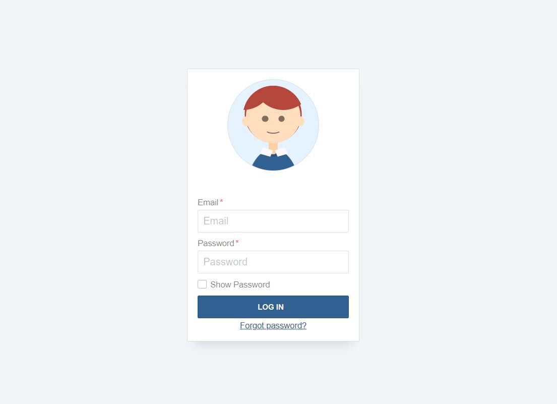
Animated Login Form 본문
728x90
SMALL
동영상 서비스가 종료되어 해당 콘텐츠를 재생할 수 없습니다.
<!DOCTYPE html>
<html lang="ko">
<head>
  <meta charset="UTF-8">
  <meta http-equiv="X-UA-Compatible" content="IE=edge">
  <meta name="viewport" content="width=device-width, initial-scale=1.0">
  <title>ANIMATED LOGIN FORM</title>
  <link rel="stylesheet" href="style.css">
</head>
<body>
  <form method="#" id="login-form" class="login-form" autocomplete="off">
    <h1 class="a11y-hidden">Login Form</h1>
    <div>
        <label class="label-email">
            <input type="email" class="text" name="email" placeholder="Email" tabindex="1" required />
            <span class="required">Email</span>
        </label>
    </div>
    <input type="checkbox" name="show-password" class="show-password a11y-hidden" id="show-password" tabindex="3" />
    <label class="label-show-password" for="show-password">
        <span>Show Password</span>
    </label>
    <div>
        <label class="label-password">
            <input type="text" class="text" name="password" placeholder="Password" tabindex="2" required />
            <span class="required">Password</span>
        </label>
    </div>
    <input type="submit" value="Log In" />
    <div class="email">
        <a href="#">Forgot password?</a>
    </div>
    <figure aria-hidden="true">
        <div class="person-body"></div>
        <div class="neck skin"></div>
        <div class="head skin">
            <div class="eyes"></div>
            <div class="mouth"></div>
        </div>
        <div class="hair"></div>
        <div class="ears"></div>
        <div class="shirt-1"></div>
        <div class="shirt-2"></div>
    </figure>
</form>
</body>
</html>
html,
body {
align-items: center;
background: #f2f4f8;
border: 0;
display: flex;
font-family: Helvetica, Arial, sans-serif;
font-size: 16px;
height: 100%;
justify-content: center;
margin: 0;
padding: 0;
}
form {
--background: white;
--border: rgba(0, 0, 0, 0.125);
--borderDark: rgba(0, 0, 0, 0.25);
--borderDarker: rgba(0, 0, 0, 0.5);
--bgColorH: 0;
--bgColorS: 0%;
--bgColorL: 98%;
--fgColorH: 210;
--fgColorS: 50%;
--fgColorL: 38%;
--shadeDark: 0.3;
--shadeLight: 0.7;
--shadeNormal: 0.5;
--borderRadius: 0.125rem;
--highlight: #306090;
background: white;
border: 1px solid var(--border);
border-radius: var(--borderRadius);
box-shadow: 0 1rem 1rem -0.75rem var(--border);
display: flex;
flex-direction: column;
padding: 1rem;
position: relative;
overflow: hidden;
}
form .email,
form .email a {
color: hsl(var(--fgColorH), var(--fgColorS), var(--fgColorL));
font-size: 0.825rem;
order: 4;
text-align: center;
margin-top: 0.25rem;
outline: 1px dashed transparent;
outline-offset: 2px;
display: inline;
}
form a:hover {
color: hsl(var(--fgColorH), var(--fgColorS), calc(var(--fgColorL) * 0.85));
transition: color 0.25s;
}
form a:focus {
color: hsl(var(--fgColorH), var(--fgColorS), calc(var(--fgColorL) * 0.85));
outline: 1px dashed
hsl(
var(--fgColorH),
calc(var(--fgColorS) * 2),
calc(var(--fgColorL) * 1.15)
);
outline-offset: 2px;
}
form > div {
order: 2;
}
label {
display: flex;
flex-direction: column;
}
.label-show-password {
order: 3;
}
label > span {
color: var(--borderDarker);
display: block;
font-size: 0.825rem;
margin-top: 0.625rem;
order: 1;
transition: all 0.25s;
}
label > span.required::after {
content: "*";
color: #dd6666;
margin-left: 0.125rem;
}
label input {
order: 2;
outline: none;
}
label input::placeholder {
color: var(--borderDark);
}
/* trick from https://css-tricks.com/snippets/css/password-input-bullet-alternatives/ */
label input[name="password"] {
-webkit-text-security: disc;
}
input[name="show-password"]:checked ~ div label input[name="password"] {
-webkit-text-security: none;
}
label:hover span {
color: hsl(var(--fgColorH), var(--fgColorS), var(--fgColorL));
}
input[type="checkbox"] + div label:hover span::before,
label:hover input.text {
border-color: hsl(var(--fgColorH), var(--fgColorS), var(--fgColorL));
}
label input.text:focus,
label input.text:active {
border-color: hsl(
var(--fgColorH),
calc(var(--fgColorS) * 2),
calc(var(--fgColorL) * 1.15)
);
box-shadow: 0 1px
hsl(
var(--fgColorH),
calc(var(--fgColorS) * 2),
calc(var(--fgColorL) * 1.15)
);
}
input.text:focus + span,
input.text:active + span {
color: hsl(
var(--fgColorH),
calc(var(--fgColorS) * 2),
calc(var(--fgColorL) * 1.15)
);
}
input {
border: 1px solid var(--border);
border-radius: var(--borderRadius);
box-sizing: border-box;
font-size: 1rem;
height: 2.25rem;
line-height: 1.25rem;
margin-top: 0.25rem;
order: 2;
padding: 0.25rem 0.5rem;
width: 15rem;
transition: all 0.25s;
}
input[type="submit"] {
color: hsl(var(--bgColorH), var(--bgColorS), var(--bgColorL));
background: hsl(var(--fgColorH), var(--fgColorS), var(--fgColorL));
font-size: 0.75rem;
font-weight: bold;
margin-top: 0.625rem;
order: 4;
outline: 1px dashed transparent;
outline-offset: 2px;
padding-left: 0;
text-transform: uppercase;
}
input[type="checkbox"]:focus + label span::before,
input[type="submit"]:focus {
outline: 1px dashed
hsl(
var(--fgColorH),
calc(var(--fgColorS) * 2),
calc(var(--fgColorL) * 1.15)
);
outline-offset: 2px;
}
input[type="submit"]:focus {
background: hsl(
var(--fgColorH),
var(--fgColorS),
calc(var(--fgColorL) * 0.85)
);
}
input[type="submit"]:hover {
background: hsl(
var(--fgColorH),
var(--fgColorS),
calc(var(--fgColorL) * 0.85)
);
}
input[type="submit"]:active {
background: hsl(
var(--fgColorH),
calc(var(--fgColorS) * 2),
calc(var(--fgColorL) * 1.15)
);
transition: all 0.125s;
}
/** Checkbox styling */
.a11y-hidden {
position: absolute;
top: -1000em;
left: -1000em;
}
input[type="checkbox"] + label span {
padding-left: 1.25rem;
position: relative;
}
input[type="checkbox"] + label span::before {
content: "";
display: block;
position: absolute;
top: 0;
left: 0;
width: 0.75rem;
height: 0.75rem;
border: 1px solid var(--borderDark);
border-radius: var(--borderRadius);
transition: all 0.25s;
outline: 1px dashed transparent;
outline-offset: 2px;
}
input[type="checkbox"]:checked + label span::after {
content: "";
display: block;
position: absolute;
top: 0.1875rem;
left: 0.1875rem;
width: 0.375rem;
height: 0.375rem;
border: 1px solid var(--borderDark);
border-radius: var(--borderRadius);
transition: all 0.25s;
outline: 1px dashed transparent;
outline-offset: 2px;
background: hsl(var(--fgColorH), var(--fgColorS), var(--fgColorL));
}
/** PERSON */
figure {
--skinH: 30;
--skinS: 100%;
--skinL: 87%;
--hair: rgb(180, 70, 60);
background: hsl(var(--fgColorH), calc(var(--fgColorS) * 2), 95%);
border: 1px solid rgba(0, 0, 0, 0.0625);
border-radius: 50%;
height: 0;
margin: auto auto;
margin-bottom: 2rem;
order: 1;
padding-top: 60%;
position: relative;
width: 60%;
overflow: hidden;
}
figure div {
position: absolute;
transform: translate(-50%, -50%);
}
figure .skin {
background: hsl(var(--skinH), var(--skinS), var(--skinL));
box-shadow: inset 0 0 3rem
hsl(var(--skinH), var(--skinS), calc(var(--skinL) * 0.95));
}
figure .head {
top: 40%;
left: 50%;
width: 60%;
height: 60%;
border-radius: 100%;
box-shadow: 0 -0.175rem 0 0.125rem var(--hair);
}
figure .ears {
top: 47%;
left: 50%;
white-space: nowrap;
}
figure .ears::before,
figure .ears::after {
content: "";
background: hsl(var(--skinH), var(--skinS), var(--skinL));
border-radius: 50%;
width: 1rem;
height: 1rem;
display: inline-block;
margin: 0 2.1rem;
}
figure .head .eyes {
top: 55%;
left: 50%;
white-space: nowrap;
}
@-webkit-keyframes blink {
0%,
90%,
100% {
height: 10px;
}
95% {
height: 0;
}
}
@keyframes blink {
0%,
90%,
100% {
height: 10px;
}
95% {
height: 0px;
}
}
figure .head .eyes::before,
figure .head .eyes::after {
content: "";
background: var(--borderDarker);
border-radius: 50%;
width: 10px;
height: 10px;
display: inline-block;
margin: 0 0.5rem;
-webkit-animation: blink 5s infinite;
animation: blink 5s infinite;
transition: all 0.15s;
}
input[name="show-password"]:checked ~ figure .head .eyes::before,
input[name="show-password"]:checked ~ figure .head .eyes::after {
height: 0.125rem;
animation: none;
}
figure .head .mouth {
border: 0.125rem solid transparent;
border-bottom: 0.125rem solid var(--borderDarker);
width: 25%;
border-radius: 50%;
transition: all 0.5s;
}
form:invalid figure .head .mouth {
top: 75%;
left: 50%;
height: 10%;
}
form:valid figure .head .mouth {
top: 60%;
left: 50%;
width: 40%;
height: 40%;
}
figure .hair {
top: 40%;
left: 50%;
width: 66.66%;
height: 66.66%;
border-radius: 100%;
overflow: hidden;
}
figure .hair::before {
content: "";
display: block;
position: absolute;
width: 100%;
height: 100%;
background: var(--hair);
border-radius: 50%;
top: -60%;
left: -50%;
box-shadow: 4rem 0 var(--hair);
}
figure .neck {
width: 10%;
height: 40%;
top: 62%;
left: 50%;
background: hsl(var(--skinH), var(--skinS), calc(var(--skinL) * 0.94));
border-radius: 0 0 2rem 2rem;
box-shadow: 0 0.25rem var(--border);
}
figure .person-body {
width: 60%;
height: 100%;
border-radius: 50%;
background: red;
left: 50%;
top: 126%;
background: hsl(var(--fgColorH), var(--fgColorS), var(--fgColorL));
}
figure .shirt-1,
figure .shirt-2 {
width: 12%;
height: 7%;
background: hsl(var(--bgColorH), var(--bgColorS), var(--bgColorL));
top: 76%;
left: 36.5%;
transform: skew(-10deg) rotate(15deg);
}
figure .shirt-2 {
left: 52.5%;
transform: skew(10deg) rotate(-15deg);
}728x90
LIST
'HTML _CSS' 카테고리의 다른 글
| Rotating 3D Image Cube (0) | 2022.07.22 |
|---|---|
| Raniy Animation (0) | 2022.07.21 |
| Mordern Sidebar Menu (0) | 2022.07.19 |
| Broken Effect (0) | 2022.07.18 |
| Progress Bar (0) | 2022.07.16 |
'HTML _CSS' Related Articles
more


