
250x250
Notice
Recent Posts
Recent Comments
Link
| 일 | 월 | 화 | 수 | 목 | 금 | 토 |
|---|---|---|---|---|---|---|
| 1 | 2 | 3 | 4 | 5 | 6 | |
| 7 | 8 | 9 | 10 | 11 | 12 | 13 |
| 14 | 15 | 16 | 17 | 18 | 19 | 20 |
| 21 | 22 | 23 | 24 | 25 | 26 | 27 |
| 28 | 29 | 30 |
Tags
- 애니메이션
- css3
- HTML
- IOS
- javascript
- effect
- 백엔드
- iPhone
- image
- html5
- hover
- SWIFT
- Animation
- iOS 개발자
- 비전공자
- php
- 자바스크립트
- 프론트엔드
- ipad
- MAC
- CSS
- 풀스택
- jQuery
- button
- 개발자
- xcode
- keyframes
- front-end
- 비전공 개발자
- react
Archives
- Today
- Total
비전공자 개발일기
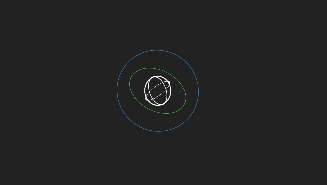
3D Spinning Orbits 본문
728x90
SMALL

<!DOCTYPE html>
<html lang="ko">

<head>
    <meta charset="UTF-8">
    <meta http-equiv="X-UA-Compatible" content="IE=edge">
    <meta name="viewport" content="width=device-width, initial-scale=1.0">
    <title>3D Spinning Orbits</title>
    <link rel="stylesheet" href="style.css">
</head>

<body>
    <div class="spinner-box">
        <div class="blue-orbit leo"></div>
        <div class="green-orbit leo"></div>
        <div class="red-orbit leo"></div>
        <div class="white-orbit w1 leo"></div>
        <div class="white-orbit w2 leo"></div>
        <div class="white-orbit w3 leo"></div>
    </div>
</body>

</html>
* {
margin: 0;
padding: 0;
box-sizing: border-box;
}
body {
display: flex;
justify-content: center;
align-items: center;
min-height: 100vh;
background-color: #222;
}
.spinner-box {
width: 300px;
height: 300px;
display: flex;
justify-content: center;
align-items: center;
background-color: transparent;
}
.leo {
position: absolute;
display: flex;
justify-content: center;
align-items: center;
border-radius: 50%;
}
.blue-orbit {
width: 165px;
height: 165px;
border: 1px solid #00a9ffa5;
animation: spin3D 3s linear 0.2s infinite;
}
.green-orbit {
width: 120px;
height: 120px;
border: 1px solid #00ff6ba5;
animation: spin3D 2s linear 0s infinite;
}
.red-orbit {
width: 90px;
height: 90px;
border: 1px solid #fb8200a5;
animation: spin3D 1s linear 0s infinite;
}
.white-orbit {
width: 60px;
height: 60px;
border: 2px solid #ffffff;
animation: spin3D 10s linear 0s infinite;
}
.w1 {
transform: rotate3D(1, 1, 1, 90deg);
}
.w2 {
transform: rotate3D(1, 2, 0.5, 90deg);
}
.w3 {
transform: rotate3D(0.5, 1, 2, 90deg);
}
@keyframes spin3D {
from {
transform: rotate3d(0.5, 0.5, 0.5, 360deg);
}
to {
transform: rotate3d(0deg);
}
}728x90
LIST
'HTML _CSS' 카테고리의 다른 글
| Fill Glass Loader (0) | 2023.01.27 |
|---|---|
| Ghost Loader (0) | 2023.01.26 |
| Pac-man Loader (0) | 2023.01.24 |
| Pendulum Loading (0) | 2023.01.23 |
| Blob Effect Micro Interaction (0) | 2023.01.22 |
'HTML _CSS' Related Articles
more


