
250x250
Notice
Recent Posts
Recent Comments
Link
| 일 | 월 | 화 | 수 | 목 | 금 | 토 |
|---|---|---|---|---|---|---|
| 1 | ||||||
| 2 | 3 | 4 | 5 | 6 | 7 | 8 |
| 9 | 10 | 11 | 12 | 13 | 14 | 15 |
| 16 | 17 | 18 | 19 | 20 | 21 | 22 |
| 23 | 24 | 25 | 26 | 27 | 28 | 29 |
| 30 |
Tags
- front-end
- javascript
- xcode
- 프론트엔드
- react
- 백엔드
- css3
- effect
- jQuery
- MAC
- hover
- html5
- keyframes
- php
- Animation
- iPhone
- 비전공 개발자
- 개발자
- 자바스크립트
- HTML
- SWIFT
- 풀스택
- ipad
- button
- 비전공자
- image
- 애니메이션
- IOS
- iOS 개발자
- CSS
Archives
- Today
- Total
비전공자 개발일기
Magic LIne Icon Hover Effects 본문
728x90
SMALL
<!DOCTYPE html>
<html lang="ko">
<head>
<meta charset="UTF-8">
<meta http-equiv="X-UA-Compatible" content="IE=edge">
<meta name="viewport" content="width=device-width, initial-scale=1.0">
<title>MAGIC LINE ICON HOVER EFFECTS</title>
<link rel="stylesheet" href="style.css">
<link rel="stylesheet" href="https://cdnjs.cloudflare.com/ajax/libs/font-awesome/4.7.0/css/font-awesome.css" integrity="sha512-5A8nwdMOWrSz20fDsjczgUidUBR8liPYU+WymTZP1lmY9G6Oc7HlZv156XqnsgNUzTyMefFTcsFH/tnJE/+xBg==" crossorigin="anonymous" referrerpolicy="no-referrer" />
</head>
<body>
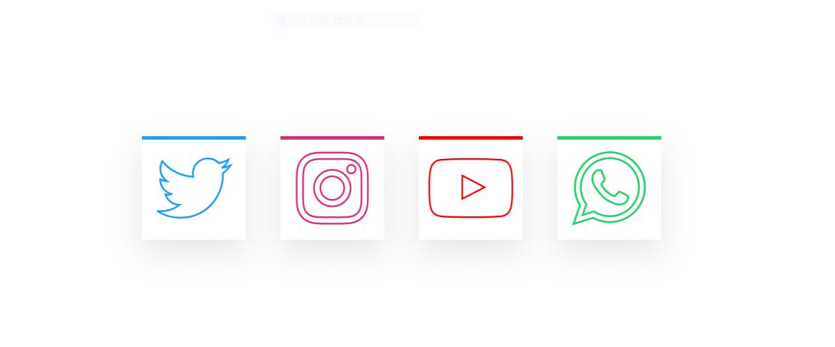
<ul>
<li style="--clr: #1DA1F2"><i class="fa fa-twitter" aria-hidden="true"></i></li>
<li style="--clr: #DD2A7B"><i class="fa fa-instagram" aria-hidden="true"></i></li>
<li style="--clr: #FF0000"><i class="fa fa-youtube-play" aria-hidden="true"></i></li>
<li style="--clr: #25D366"><i class="fa fa-whatsapp" aria-hidden="true"></i></li>
</ul>
</body>
</html>* {
margin: 0;
padding: 0;
box-sizing: border-box;
}
body {
display: flex;
justify-content: center;
align-items: center;
min-height: 100vh;
}
h1 {
text-align: center;
}
ul {
position: relative;
display: flex;
gap: 40px;
}
ul li {
position: relative;
list-style: none;
width: 120px;
height: 120px;
display: flex;
justify-content: center;
align-items: center;
background: #FFF;
box-shadow: 0 15px 35px rgba(0, 0, 0, .1);
cursor: pointer;
}
ul li .fa {
font-size: 6em;
-webkit-text-stroke: 2px var(--clr);
color: transparent;
}
ul li::before {
content: '';
position: absolute;
top: 0;
left: 0;
width: 100%;
height: 0;
overflow: hidden;
border-bottom: 4px solid var(--clr);
transition: .5s ease-in-out;
font-family: fontAwesome;
text-align: center;
line-height: 120px;
font-size: 6em;
color: var(--clr);
}
ul li:hover::before {
height: 100%;
}
ul li:nth-child(1):before {
content: '\f099';
}
ul li:nth-child(2):before {
content: '\f16d';
}
ul li:nth-child(3):before {
content: '\f16a';
}
ul li:nth-child(4):before {
content: '\f232';
}728x90
LIST
'HTML _CSS' 카테고리의 다른 글
| WhatsApp LOGO (0) | 2022.07.29 |
|---|---|
| Bubble Animation (0) | 2022.07.28 |
| Ambient Light Effects (0) | 2022.07.25 |
| Flight Loader (0) | 2022.07.24 |
| Modern CSS Button Glowing Effect (0) | 2022.07.23 |
'HTML _CSS' Related Articles
more


