
250x250
Notice
Recent Posts
Recent Comments
Link
| 일 | 월 | 화 | 수 | 목 | 금 | 토 |
|---|---|---|---|---|---|---|
| 1 | ||||||
| 2 | 3 | 4 | 5 | 6 | 7 | 8 |
| 9 | 10 | 11 | 12 | 13 | 14 | 15 |
| 16 | 17 | 18 | 19 | 20 | 21 | 22 |
| 23 | 24 | 25 | 26 | 27 | 28 | 29 |
| 30 |
Tags
- css3
- 백엔드
- IOS
- html5
- jQuery
- javascript
- CSS
- 자바스크립트
- 풀스택
- button
- 애니메이션
- 프론트엔드
- 비전공 개발자
- react
- keyframes
- MAC
- front-end
- xcode
- SWIFT
- iPhone
- 비전공자
- php
- 개발자
- image
- HTML
- effect
- iOS 개발자
- hover
- Animation
- ipad
Archives
- Today
- Total
비전공자 개발일기
Bubble Animation 본문
728x90
SMALL
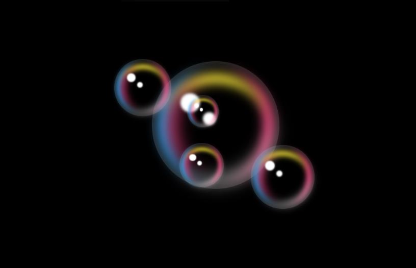
<!DOCTYPE html>
<html lang="ko">
<head>
  <meta charset="UTF-8">
  <meta http-equiv="X-UA-Compatible" content="IE=edge">
  <meta name="viewport" content="width=device-width, initial-scale=1.0">
  <title>SOUP BUBBLE ANIMATION</title>
  <link rel="stylesheet" href="style.css">
</head>
<body>
  <div class="bubble">
    <span></span>
    <span></span>
    <span></span>
    <span></span>
    <span></span>
  </div>
  <div class="bubble">
    <span></span>
    <span></span>
    <span></span>
    <span></span>
    <span></span>
  </div>
  <div class="bubble">
    <span></span>
    <span></span>
    <span></span>
    <span></span>
    <span></span>
  </div>
  <div class="bubble">
    <span></span>
    <span></span>
    <span></span>
    <span></span>
    <span></span>
  </div>
  <div class="bubble">
    <span></span>
    <span></span>
    <span></span>
    <span></span>
    <span></span>
  </div>
</body>
</html>
* {
margin: 0;
padding: 0;
box-sizing: border-box;
}
body {
display: flex;
justify-content: center;
align-items: center;
min-height: 100vh;
background-color: #000;
}
.bubble {
position: absolute;
width: 200px;
height: 200px;
border-radius: 50%;
box-shadow: inset 0 0 25px rgba(255, 255, 255, .25);
animation: animate 8s ease-in-out infinite;
}
.bubble:nth-child(2) {
position: relative;
zoom: .45;
left: -10px;
top: -100px;
animation-delay: -4s;
}
.bubble:nth-child(3) {
position: relative;
zoom: .25;
right: -80px;
top: -30px;
animation-delay: -6s;
}
.bubble:nth-child(4) {
position: relative;
zoom: .35;
left: -120px;
bottom: -200px;
animation-delay: -3s;
}
.bubble:nth-child(5) {
position: relative;
zoom: .5;
left: 0;
top: 200px;
animation-delay: -5s;
}
@keyframes animate {
0%, 100% {
transform: translateY(-20px);
}
50% {
transform: translateY(20px);
}
}
.bubble::before {
content: '';
position: absolute;
top: 50px;
left: 45px;
width: 30px;
height: 30px;
border-radius: 50%;
background-color: #FFF;
z-index: 10;
filter: blur(2px);
}
.bubble::after {
content: '';
position: absolute;
top: 80px;
left: 80px;
width: 20px;
height: 20px;
border-radius: 50%;
background-color: #FFF;
z-index: 10;
filter: blur(2px);
}
.bubble span {
position: absolute;
border-radius: 50%;
}
.bubble span:nth-child(1) {
inset: 10px;
border-left: 15px solid #0FB4FF;
filter: blur(8px);
}
.bubble span:nth-child(2) {
inset: 10px;
border-right: 15px solid #FF4484;
filter: blur(8px);
}
.bubble span:nth-child(3) {
inset: 20px;
border-top: 15px solid #FFEB3B;
filter: blur(8px);
}
.bubble span:nth-child(4) {
inset: 23px;
border-left: 15px solid #FF4484;
filter: blur(12px);
}
.bubble span:nth-child(5) {
inset: 10px;
border-bottom: 10px solid #FFF;
filter: blur(12px);
transform: rotate(330deg);
}728x90
LIST
'HTML _CSS' 카테고리의 다른 글
| Neumorphism Custom Range Slider (0) | 2022.07.30 |
|---|---|
| WhatsApp LOGO (0) | 2022.07.29 |
| Magic LIne Icon Hover Effects (0) | 2022.07.26 |
| Ambient Light Effects (0) | 2022.07.25 |
| Flight Loader (0) | 2022.07.24 |
'HTML _CSS' Related Articles
more


