
250x250
Notice
Recent Posts
Recent Comments
Link
| 일 | 월 | 화 | 수 | 목 | 금 | 토 |
|---|---|---|---|---|---|---|
| 1 | 2 | 3 | ||||
| 4 | 5 | 6 | 7 | 8 | 9 | 10 |
| 11 | 12 | 13 | 14 | 15 | 16 | 17 |
| 18 | 19 | 20 | 21 | 22 | 23 | 24 |
| 25 | 26 | 27 | 28 | 29 | 30 | 31 |
Tags
- ipad
- HTML
- button
- effect
- front-end
- php
- xcode
- 비전공 개발자
- 백엔드
- Animation
- html5
- 프론트엔드
- 비전공자
- 자바스크립트
- jQuery
- javascript
- image
- 애니메이션
- iOS 개발자
- hover
- IOS
- SWIFT
- iPhone
- 풀스택
- css3
- react
- 개발자
- keyframes
- CSS
- MAC
Archives
- Today
- Total
비전공자 개발일기
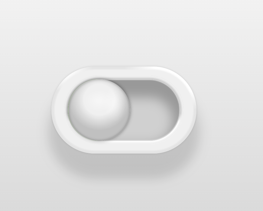
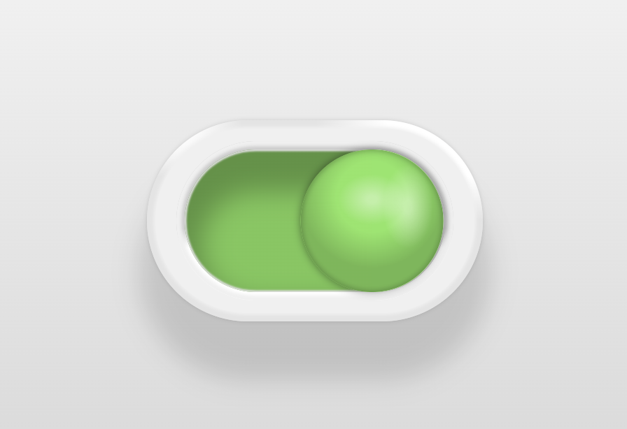
Toggle Button Animation 본문
728x90
SMALL
<!DOCTYPE html>
<html lang="ko">
<head>
    <meta charset="UTF-8">
    <meta http-equiv="X-UA-Compatible" content="IE=edge">
    <meta name="viewport" content="width=device-width, initial-scale=1.0">
    <title>TOGGLE BUTTON ANIMATAION</title>
    <link rel="stylesheet" href="style.css">
</head>
<body>
    <input type="checkbox" name="toggle" id="toggle" value="is_on">
    <label for="toggle" class="toy-toggle">
        <span class="border1"></span>
        <span class="border2"></span>
        <span class="border3"></span>
        <span class="handle">
            <span class="handle-off"></span>
            <span class="handle-on"></span>
        </span>
    </label>
</body>
</html>
*,
*:before,
*:after {
border: 0;
box-sizing: border-box;
margin: 0;
padding: 0;
}
body {
background: linear-gradient(#fff, #ccc);
display: flex;
height: 100vh;
--on: #88e661;
--off: #f0f0f0;
--transDur: 0.6s;
}
input {
position: fixed;
transform: translateX(-100%);
}
.toy-toggle {
background: radial-gradient(at top left, #fff 10%, #fff0 20%),
radial-gradient(at top right, #fff 20%, #e4e4e4 35%);
border-radius: 6em;
box-shadow: 0 0 0.25em #0002, 0 3em 1.5em 0.5em #0002;
cursor: pointer;
display: block;
font-size: 12px;
position: relative;
margin: auto;
width: 20em;
height: 12em;
-webkit-tap-highlight-color: transparent;
}
.toy-toggle span {
display: block;
position: absolute;
}
.toy-toggle>span {
top: 50%;
left: 50%;
}
.toy-toggle>span:not(.handle) {
transform: translate(-50%, -50%);
}
.border1 {
background: #f0f0f0;
border-radius: 5.5em;
box-shadow: 0 0 0.2em 0.1em #f0f0f0;
width: 19em;
height: 11em;
}
.border2 {
background: linear-gradient(0deg, #fff 33%, #ccc 45%);
border-radius: 4.75em;
box-shadow: 0 0 0.2em 0.3em #f0f0f0 inset;
width: 16.5em;
height: 9.5em;
}
.border3,
.handle {
background: linear-gradient(90deg, var(--on) 50%, var(--off) 0);
}
.border3 {
background-position: 75% 0;
background-size: 200% 100%;
border-radius: 4.25em;
box-shadow: 0 0 0.1em 0.1em #ddd inset, 0 1.5em 1.5em 1em #0004 inset,
0 0 0 4.25em #0002 inset;
width: 15.5em;
height: 8.5em;
transition: background-position var(--transDur) ease-in-out;
}
.handle {
border-radius: 50%;
box-shadow: 0 0 0.5em 0 #0007;
width: 8.5em;
height: 8.5em;
transform: translate(-90%, -50%);
transition: transform var(--transDur) ease-in-out;
z-index: 0;
}
.handle:before {
background: radial-gradient(2em 1.5em at 50% 35%, #fff6 15%, #fff0),
radial-gradient(1.5em 2.5em at 75% 40%, #fff6 15%, #fff0),
radial-gradient(100% 100% at 50% 33%, #0000 25%, #0003 50%);
border-radius: 50%;
box-shadow: 0 0 0.3em 0.1em #0003 inset;
content: "";
display: block;
position: absolute;
top: 0;
left: 0;
width: 100%;
height: 100%;
z-index: 3;
}
.handle-off,
.handle-on {
width: 50%;
height: 100%;
transition: transform calc(var(--transDur) / 2);
z-index: 2;
}
.handle-off {
background: var(--off);
border-radius: 100% 0 0 100% / 50% 50% 50% 50%;
right: 50%;
transform-origin: 100% 50%;
transition-delay: calc(var(--transDur) / 2);
transition-timing-function: ease-out;
}
.handle-on {
background: var(--on);
border-radius: 0 100% 100% 0 / 50% 50% 50% 50%;
left: 50%;
transform: scaleX(0);
transform-origin: 0 50%;
transition-timing-function: ease-in;
}
/* On */
input:checked+.toy-toggle .border3 {
background-position: 25% 0;
}
input:checked+.toy-toggle .handle {
transform: translate(-10%, -50%);
}
input:checked+.toy-toggle .handle-off {
transform: scaleX(0);
transition-delay: 0s;
transition-timing-function: ease-in;
}
input:checked+.toy-toggle .handle-on {
transform: scaleX(1);
transition-delay: calc(var(--transDur) / 2);
transition-timing-function: ease-out;
}728x90
LIST
'HTML _CSS' 카테고리의 다른 글
| Water Drop Card (0) | 2022.11.18 |
|---|---|
| BG CSS Effect (0) | 2022.11.17 |
| Responsive Services Section (0) | 2022.11.11 |
| Main Page in WEB (0) | 2022.11.10 |
| Filter Gallery (0) | 2022.11.07 |
'HTML _CSS' Related Articles
more


