
250x250
Notice
Recent Posts
Recent Comments
Link
| 일 | 월 | 화 | 수 | 목 | 금 | 토 |
|---|---|---|---|---|---|---|
| 1 | 2 | 3 | 4 | 5 | 6 | |
| 7 | 8 | 9 | 10 | 11 | 12 | 13 |
| 14 | 15 | 16 | 17 | 18 | 19 | 20 |
| 21 | 22 | 23 | 24 | 25 | 26 | 27 |
| 28 | 29 | 30 |
Tags
- 애니메이션
- css3
- 백엔드
- image
- 개발자
- front-end
- xcode
- IOS
- 비전공 개발자
- 자바스크립트
- html5
- react
- iPhone
- hover
- Animation
- SWIFT
- ipad
- javascript
- 비전공자
- 풀스택
- CSS
- effect
- button
- jQuery
- iOS 개발자
- php
- 프론트엔드
- keyframes
- MAC
- HTML
Archives
- Today
- Total
비전공자 개발일기
Cube Hover 본문
728x90
SMALL
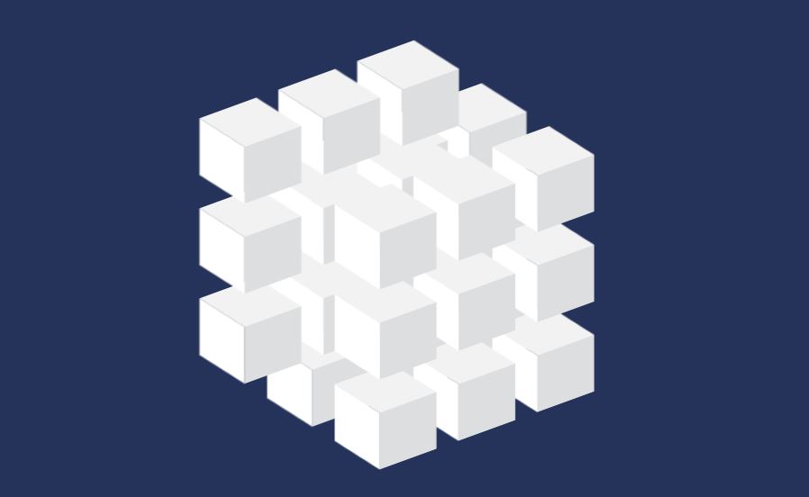
동영상 서비스가 종료되어 해당 콘텐츠를 재생할 수 없습니다.
<!DOCTYPE html>
<html lang="ko">
<head>
  <meta charset="UTF-8">
  <meta http-equiv="X-UA-Compatible" content="IE=edge">
  <meta name="viewport" content="width=device-width, initial-scale=1.0">
  <title>CUBE HOVER</title>
  <link rel="stylesheet" href="style.css">
</head>
<body>
  <div class="container">
    <div class="cube">
      <div style="--x:-1;--y:0;">
        <span style="--i:3;"></span>
        <span style="--i:2;"></span>
        <span style="--i:1;"></span>
      </div>
      <div style="--x:0;--y:0;">
        <span style="--i:3;"></span>
        <span style="--i:2;"></span>
        <span style="--i:1;"></span>
      </div>
      <div style="--x:1;--y:0;">
        <span style="--i:3;"></span>
        <span style="--i:2;"></span>
        <span style="--i:1;"></span>
      </div>
    </div>
  </div>
</body>
</html>
* {
margin: 0;
padding: 0;
box-sizing: border-box;
}
body {
display: flex;
justify-content: center;
align-items: center;
background-color: #25335B;
min-height: 100vh;
}
.container {
position: relative;
top: -80px;
transform: skewY(-20deg);
animation: animate 5s linear infinite;
}
@keyframes animate {
0% {
filter: hue-rotate(0);
}
100% {
filter: hue-rotate(360deg);
}
}
.container .cube {
z-index: 2;
position: relative;
}
.container .cube:nth-child(2) {
z-index: 2;
translate: -60px -60px;
}
.container .cube:nth-child(3) {
z-index: 2;
translate: 60px 60px;
}
.container .cube div {
position: absolute;
display: flex;
flex-direction: column;
gap: 30px;
translate: calc(-70px * var(--x)) calc(-60px * var(--y));
}
.container .cube div span {
position: relative;
display: inline-block;
width: 50px;
height: 50px;
background-color: #DCDEDC;
z-index: calc(1 * var(--i));
transition: 1.5s;
}
.container .cube div span:hover {
transition: 0s;
background-color: #EF4149;
filter: drop-shadow(0 0 30px #EF4149);
}
.container .cube div span::before {
content: '';
position: absolute;
left: -40px;
width: 40px;
height: 100%;
background-color: #FFF;
transform-origin: right;
transform:skewY(45deg);
transition: 1.5s;
}
.container .cube div span:hover::before {
transition: 0s;
background-color: #F75D64;
}
.container .cube div span::after {
content: '';
position: absolute;
top: -40px;
left: 0;
width: 100%;
height: 40px;
background-color: #F2F2F2;
transform-origin: bottom;
transform:skewX(45deg);
transition: 1.5s;
}
.container .cube div span:hover::after {
transition: 0s;
background-color: #F14E55;
}728x90
LIST
'HTML _CSS' 카테고리의 다른 글
| Animated Radial Menu (0) | 2022.10.02 |
|---|---|
| Image Check (0) | 2022.10.01 |
| Responsive Email Subscription Form (0) | 2022.09.28 |
| Animated Skills bar (0) | 2022.09.26 |
| Text Animation & BG (0) | 2022.09.25 |
'HTML _CSS' Related Articles
more


