
250x250
Notice
Recent Posts
Recent Comments
Link
| 일 | 월 | 화 | 수 | 목 | 금 | 토 |
|---|---|---|---|---|---|---|
| 1 | 2 | 3 | ||||
| 4 | 5 | 6 | 7 | 8 | 9 | 10 |
| 11 | 12 | 13 | 14 | 15 | 16 | 17 |
| 18 | 19 | 20 | 21 | 22 | 23 | 24 |
| 25 | 26 | 27 | 28 | 29 | 30 | 31 |
Tags
- Animation
- 백엔드
- php
- react
- MAC
- xcode
- css3
- 비전공 개발자
- IOS
- html5
- CSS
- hover
- effect
- iPhone
- SWIFT
- 프론트엔드
- 자바스크립트
- iOS 개발자
- image
- front-end
- keyframes
- jQuery
- 비전공자
- 풀스택
- javascript
- ipad
- button
- HTML
- 개발자
- 애니메이션
Archives
- Today
- Total
비전공자 개발일기
Image Check 본문
728x90
SMALL

<!DOCTYPE html>
<html lang="en">
<head>
<meta charset="UTF-8">
<meta http-equiv="X-UA-Compatible" content="IE=edge">
<meta name="viewport" content="width=device-width, initial-scale=1.0">
<title>USE IMG CHECK</title>
<link rel="stylesheet" href="style.css">
</head>
<body>
<ul>
<li>
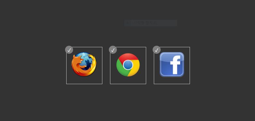
<input type="checkbox" id="myCheckbox1" />
<label for="myCheckbox1"><img src="http://townandcountryremovals.com/wp-content/uploads/2013/10/firefox-logo-200x200.png" /></label>
</li>
<li>
<input type="checkbox" id="myCheckbox2" />
<label for="myCheckbox2"><img src="http://tech21info.com/admin/wp-content/uploads/2013/03/chrome-logo-200x200.png" /></label>
</li>
<li>
<input type="checkbox" id="myCheckbox3" />
<label for="myCheckbox3"><img src="http://www.thebusinessofsports.com/wp-content/uploads/2010/10/facebook-icon-200x200.png" /></label>
</li>
</ul>
</body>
</html>* {
margin: 0;
padding: 0;
box-sizing: border-box;
}
body {
display: flex;
justify-content: center;
align-items: center;
min-height: 100vh;
background-color: #333;
}
ul {
list-style-type: none;
}
li {
display: inline-block;
}
input[type="checkbox"][id^="myCheckbox"] {
display: none;
}
label {
border: 1px solid #fff;
padding: 10px;
display: block;
position: relative;
margin: 10px;
cursor: pointer;
}
label:before {
background-color: white;
color: white;
content: " ";
display: block;
border-radius: 50%;
border: 1px solid grey;
position: absolute;
top: -5px;
left: -5px;
width: 25px;
height: 25px;
text-align: center;
line-height: 28px;
transition-duration: 0.4s;
transform: scale(0);
}
label img {
height: 100px;
width: 100px;
transition-duration: 0.2s;
transform-origin: 50% 50%;
}
:checked + label {
border-color: #ddd;
}
:checked + label:before {
content: "✓";
background-color: grey;
transform: scale(1);
}
:checked + label img {
transform: scale(0.9);
/* box-shadow: 0 0 5px #333; */
z-index: -1;
}728x90
LIST
'HTML _CSS' 카테고리의 다른 글
| Page Flip (0) | 2022.10.04 |
|---|---|
| Animated Radial Menu (0) | 2022.10.02 |
| Cube Hover (0) | 2022.09.30 |
| Responsive Email Subscription Form (0) | 2022.09.28 |
| Animated Skills bar (0) | 2022.09.26 |
'HTML _CSS' Related Articles
more


