
250x250
Notice
Recent Posts
Recent Comments
Link
| 일 | 월 | 화 | 수 | 목 | 금 | 토 |
|---|---|---|---|---|---|---|
| 1 | 2 | 3 | ||||
| 4 | 5 | 6 | 7 | 8 | 9 | 10 |
| 11 | 12 | 13 | 14 | 15 | 16 | 17 |
| 18 | 19 | 20 | 21 | 22 | 23 | 24 |
| 25 | 26 | 27 | 28 | 29 | 30 | 31 |
Tags
- iPhone
- button
- 풀스택
- SWIFT
- react
- effect
- front-end
- javascript
- xcode
- Animation
- 자바스크립트
- MAC
- 백엔드
- php
- HTML
- 개발자
- iOS 개발자
- IOS
- css3
- ipad
- 비전공 개발자
- keyframes
- 비전공자
- html5
- 프론트엔드
- hover
- CSS
- jQuery
- 애니메이션
- image
Archives
- Today
- Total
비전공자 개발일기
Plus Neon BTN 본문
728x90
SMALL
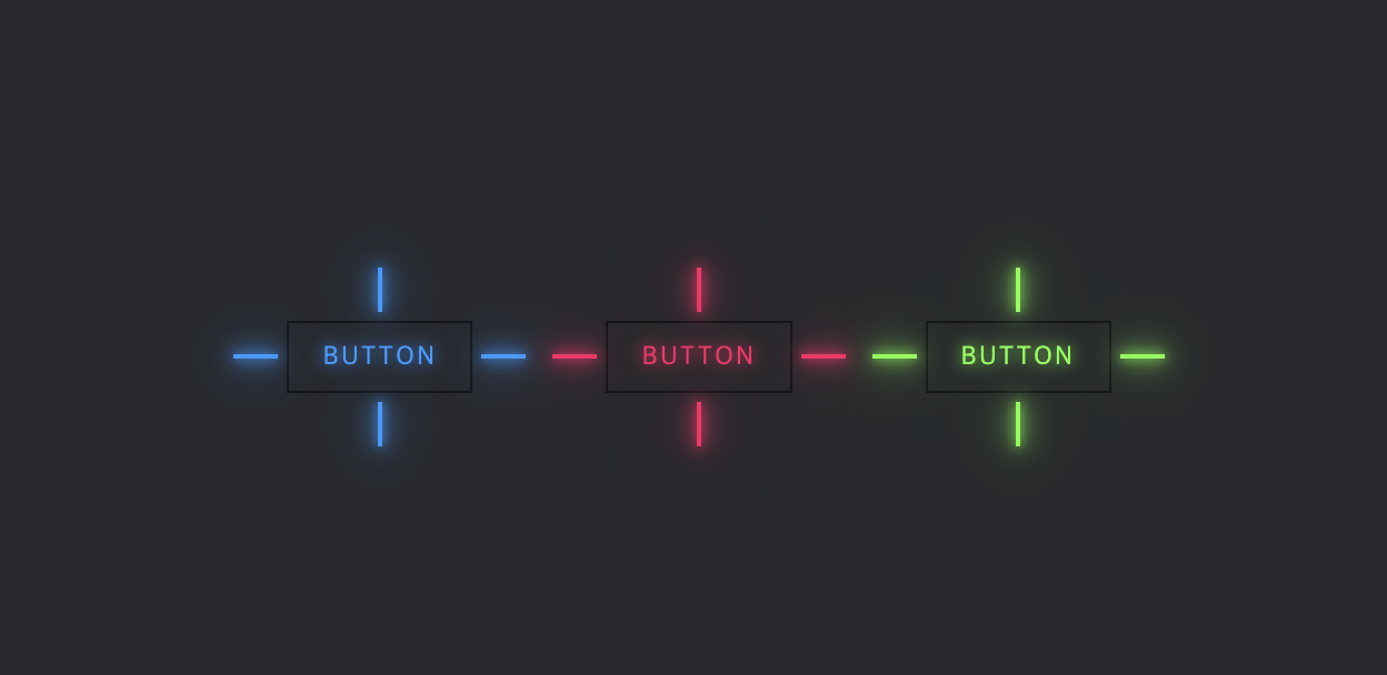
<!DOCTYPE html>
<html lang="ko">
<head>
    <meta charset="UTF-8">
    <meta http-equiv="X-UA-Compatible" content="IE=edge">
    <meta name="viewport" content="width=device-width, initial-scale=1.0">
    <title>PLUS LEON BTN</title>
    <link rel="stylesheet" href="style.css">
</head>
<body>
    <div class="container">
        <a href="#" style="--clr:#1E9BFF;">
            <span></span>
            <span></span>
            <span></span>
            <span></span>
            Button
        </a>
        <a href="#" style="--clr:#FF1867;">
            <span></span>
            <span></span>
            <span></span>
            <span></span>
            Button
        </a>
        <a href="#" style="--clr:#6EFF3E;">
            <span></span>
            <span></span>
            <span></span>
            <span></span>
            Button
        </a>
    </div>
</body>
</html>
* {
margin: 0;
padding: 0;
box-sizing: border-box;
}
body {
display: flex;
justify-content: center;
align-items: center;
min-height: 100vh;
background-color: #27282C;
}
.container {
display: flex;
justify-content: center;
align-items: center;
flex-wrap: wrap;
gap: 120px;
}
.container a {
position: relative;
padding: 16px 30px;
font-size: 1.5em;
color: var(--clr);
text-shadow: 0 0 15px var(--clr);
text-decoration: none;
text-transform: uppercase;
letter-spacing: .1em;
transition: .5s;
border: 2px solid rgba(0, 0, 0, .5);
}
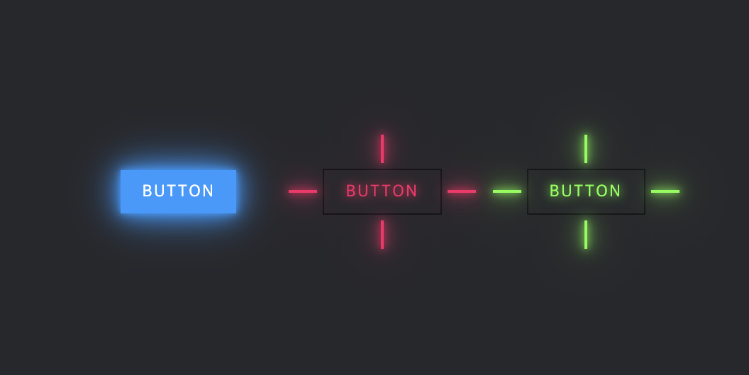
.container a:hover {
color: #FFF;
border: 2px solid rgba(0, 0, 0, 0);
text-shadow: 0 0 0 var(--clr);
}
.container a::before {
content: '';
position: absolute;
top: 0;
left: 0;
width: 100%;
height: 100%;
background-color: var(--clr);
z-index: -1;
transform: scale(0);
transition: .5s;
}
.container a:hover::before {
transform: scale(1);
transition-delay: .5s;
box-shadow: 0 0 10px var(--clr), 0 0 30px var(--clr), 0 0 60px var(--clr);
}
.container a span {
position: absolute;
background-color: var(--clr);
pointer-events: none;
box-shadow: 0 0 10px var(--clr), 0 0 20px var(--clr), 0 0 30px var(--clr), 0 0 50px var(--clr), 0 0 100px var(--clr);
}
.container a span:nth-child(2n+1) {
width: 40px;
height: 4px;
}
.container a span:nth-child(2n) {
width: 4px;
height: 40px;
}
.container a span:nth-child(1) {
top: calc(50% - 2px);
left: -50px;
transform-origin: left;
transition: .5s ease-in-out;
transition-delay: .25s;
}
.container a:hover span:nth-child(1) {
left: 50%;
transform: scaleX(0);
opacity: 0;
transition-delay: 0;
}
.container a span:nth-child(2) {
top: -50px;
left: calc(50% - 2px);
transform-origin: top;
transition: .5s ease-in-out;
transition-delay: .25s;
}
.container a:hover span:nth-child(2) {
top: 50%;
transform: scaleY(0);
opacity: 0;
transition-delay: 0;
}
.container a span:nth-child(3) {
top: calc(50% - 2px);
right: -50px;
transform-origin: right;
transition: .5s ease-in-out;
transition-delay: .25s;
}
.container a:hover span:nth-child(3) {
right: 50%;
transform: scaleX(0);
opacity: 0;
transition-delay: 0;
}
.container a span:nth-child(4) {
bottom: -50px;
left: calc(50% - 2px);
transform-origin: bottom;
transition: .5s ease-in-out;
transition-delay: .25s;
}
.container a:hover span:nth-child(4) {
bottom: 50%;
transform: scaleY(0);
opacity: 0;
transition-delay: 0;
}728x90
LIST
'HTML _CSS' 카테고리의 다른 글
| Rotating border (0) | 2022.11.23 |
|---|---|
| Postage Stamp Cutout (0) | 2022.11.22 |
| Sticky Cards (0) | 2022.11.20 |
| Water Drop Card (0) | 2022.11.18 |
| BG CSS Effect (0) | 2022.11.17 |
'HTML _CSS' Related Articles
more


